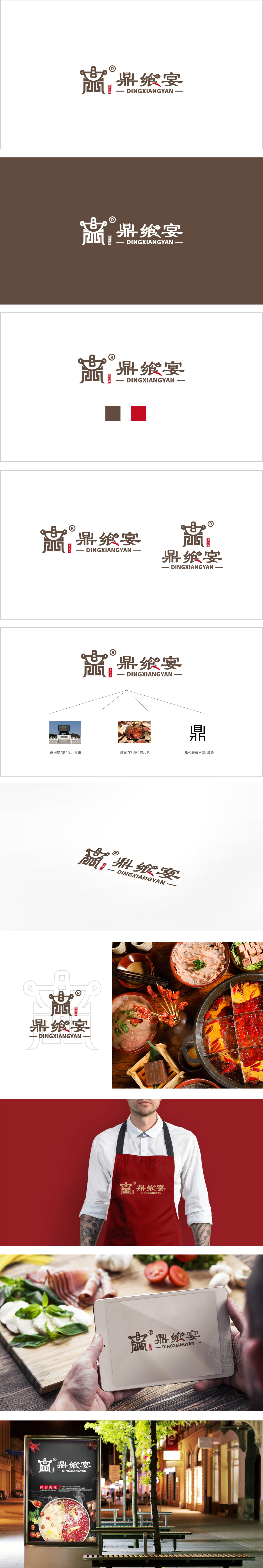
狮动设计以抽象化“鼎”形图案为核心视觉符号,通过几何线条简化处理,既保留传统器物的庄重感,又避免复古元素的沉重感。鼎作为中国古代礼器,象征“尊贵、盛宴、权威”,直接呼应“鼎飨宴”的品牌名称,暗示品牌主打高端餐饮、文化宴请的定位。鼎形内部嵌入类似“食”字的抽象结构,强化“餐饮”属性;两侧环形“耳”部设计增加对称美感,同时形成保护、包容的视觉意象,暗合“宴请”场景的聚会属性。通过传统符号的现代重构、文化内涵的精准植入、视觉元素的平衡设计,成功塑造了一个兼具“高端感、文化性、食欲感”的品牌形象。
Lion design takes the abstract "Ding" pattern as the core visual symbol, and simplifies the geometric lines, which not only retains the solemn sense of traditional utensils, but also avoids the heavy sense of retro elements. Ding, as an ancient ritual vessel in China, symbolizes "dignity, feast and authority", directly echoes the brand name of "Ding Banquet", suggesting that the brand focuses on high-end catering and cultural banquets. An abstract structure similar to the word "food" is embedded in the tripod to strengthen the attribute of "catering"; The ring-shaped "ears" on both sides increase the symmetrical aesthetic feeling, and at the same time form a protective and inclusive visual image, which coincides with the party attribute of the "banquet" scene.


扫码或拨打添加客服微信


