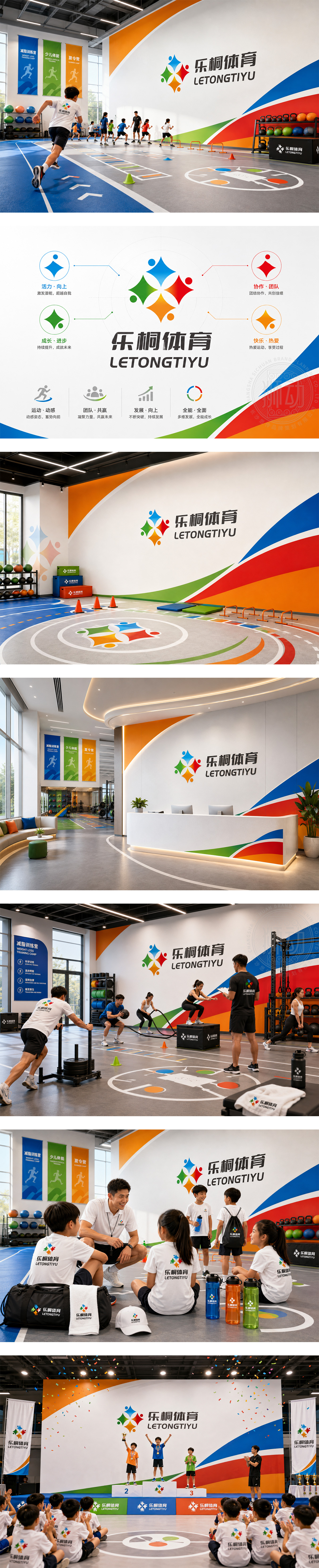
标志由四个色彩明快的抽象人形组成,手牵手围成绽放的花朵造型,象征着团结、活力与快乐成长,完美契合减肥营、少儿体能及夏令营的多元场景。四色代表丰富多样的训练课程与充满朝气的青少年群体。图形中心的留白形成十字星芒,寓意健康与希望。字体稳重有力,传递专业体育精神。整体设计充满动感与亲和力,彰显了“乐桐体育”倡导快乐运动、强健体魄的品牌宗旨。
The logo features four vibrant, abstract human figures joining hands to form a blooming flower, symbolizing unity, vitality, and joyful growth. It perfectly fits diverse scenarios like weight-loss camps, youth fitness training, and summer camps. The four colors represent diverse programs and energetic young participants. The negative space in the center forms a star, implying health and hope. The bold typography conveys professional sportsmanship. Full of dynamism and affinity, the design highlights the brand's mission to advocate happy exercise and physical strength.




扫码或拨打添加客服微信


