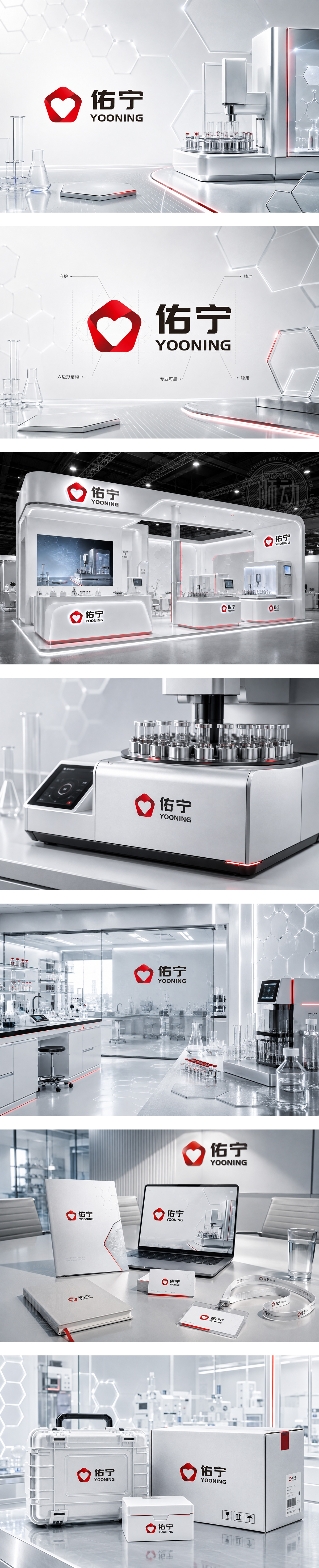
标志图形由红色丝带交织成盾形轮廓,中心镂空为爱心,寓意“佑护平安,宁静致远”的品牌理念。盾形象征化工仪器行业对精准、安全与品质的严苛坚守;爱心则传递以人为本的服务温度。深灰色字体稳重硬朗,彰显工业制造的专业与可靠。红灰配色既具视觉冲击力,又显理性沉稳。整体设计将科技硬实力与人文关怀融合,塑造了值得信赖的高端仪器制造品牌形象。
The graphic features a red ribbon woven into a shield with a heart at its core, embodying the brand philosophy of protection and tranquility. The shield symbolizes the strict standards of safety, precision, and quality essential in the chemical instrumentation industry, while the heart conveys human-centered service. The dark gray typography is robust and professional, reflecting manufacturing reliability. The red and gray palette balances visual impact with rational stability. This design merges technological strength with human care, establishing a trustworthy high-end brand image.




扫码或拨打添加客服微信


