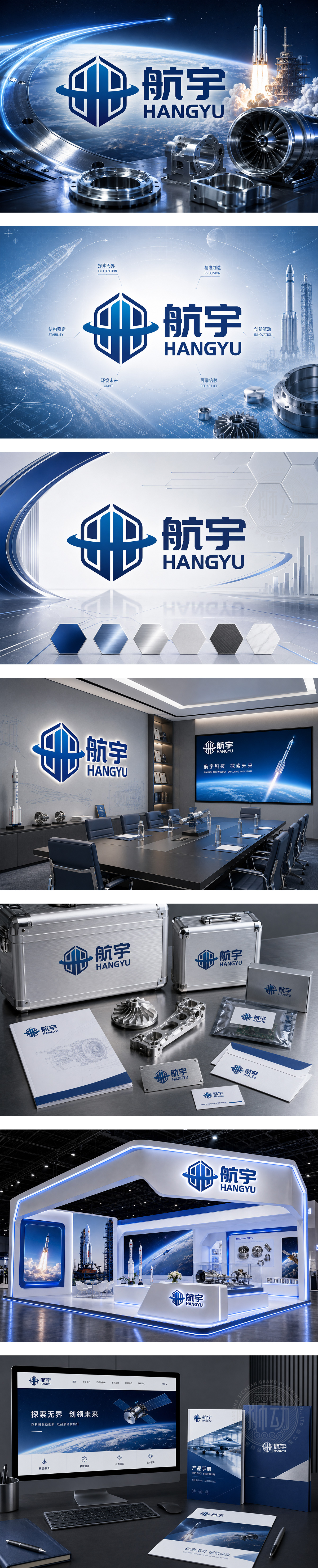
标志以深邃蓝为主色调,呼应航天科技的冷静与精密。左侧几何图形融合航天器舱体轮廓与六边形结构,象征稳定、模块化的工业美学;环绕的弧线如轨道或气流,体现动态与全球化视野。右侧“航宇 HANGYU”字体方正有力,传递专业与信赖。整体设计兼具科技感与工程美学,精准传达航天航空零部件产品的精密制造与高端定位。
The logo uses deep blue to reflect the precision and coolness of aerospace technology. The left geometric icon merges spacecraft module contours with a hexagonal structure — symbolizing stability and modular industrial design. The encircling arc suggests orbital motion or airflow, evoking dynamism and global reach. “HANGYU” in bold, clean typography conveys professionalism and reliability. The design balances tech-forward aesthetics with engineering rigor, perfectly embodying high-precision aerospace components.infrastructure.




扫码或拨打添加客服微信


