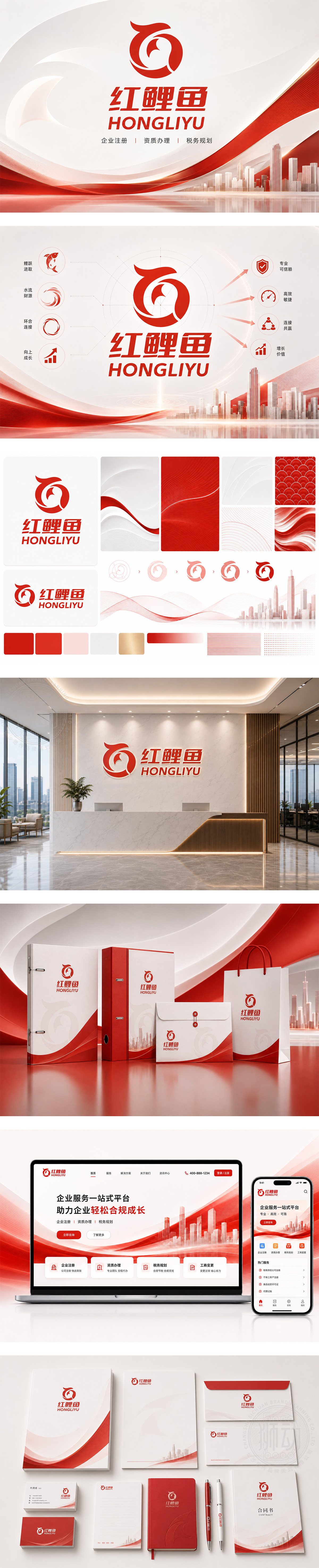
标志以高饱和中国红为主色调,传递热情、活力与信赖感。左侧图形巧妙融合“鲤鱼跃动”形态与字母“C”(代表“财税/服务”),寓意企业如红鲤腾跃,借力专业服务实现成长突破;右侧“红鲤鱼 HONGLIYU”字体稳重有力,兼具亲和力与专业感。整体设计简洁醒目,传达为中小微企业提供一站式工商、资质、税筹服务的使命——助企“跃龙门”,稳健前行。
The logo uses vibrant Chinese red to convey passion, energy, and trust. The left icon blends a leaping carp with the letter “C” (for “Compliance / Consulting”), symbolizing SMEs rising with professional support. Right-side “HONGLIYU” typography is bold yet approachable — balancing professionalism and warmth. Clean, memorable, and dynamic, it embodies the brand’s mission: helping small businesses navigate registration, licensing, and tax planning — empowering them to “leap the dragon gate” toward success.




扫码或拨打添加客服微信


