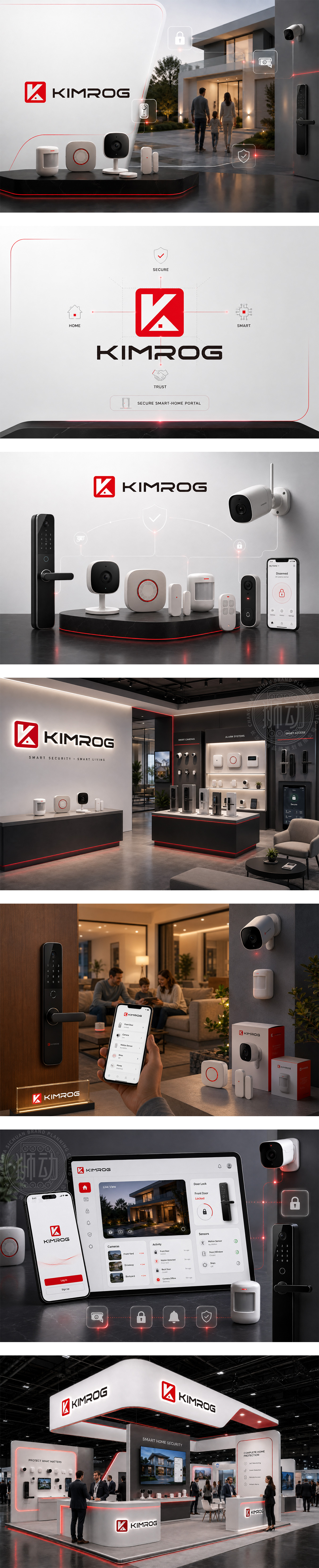
标志以醒目红色方块为底,内嵌白色负空间构成的“K”字母,巧妙融合房屋轮廓与守护红点,直观传达“家庭守护”核心概念。下方“KIMROG”采用稳重无衬线字体,强化科技感与可靠性。整体视觉简洁有力,红白对比激发安全感与警觉性,契合家庭安防产品“全天候防护、安心托付”的品牌承诺,兼具识别度与情感温度。
The logo features a bold red square with a white negative-space “K” that subtly forms a house silhouette and a guardian dot — instantly communicating home protection. Below, “KIMROG” in a sturdy sans-serif font reinforces tech credibility and trust. High-contrast red-white evokes alertness and safety, aligning with the brand promise: “24/7 protection, peace of mind.” Clean, memorable, and emotionally resonant — perfect for smart home security.




扫码或拨打添加客服微信


