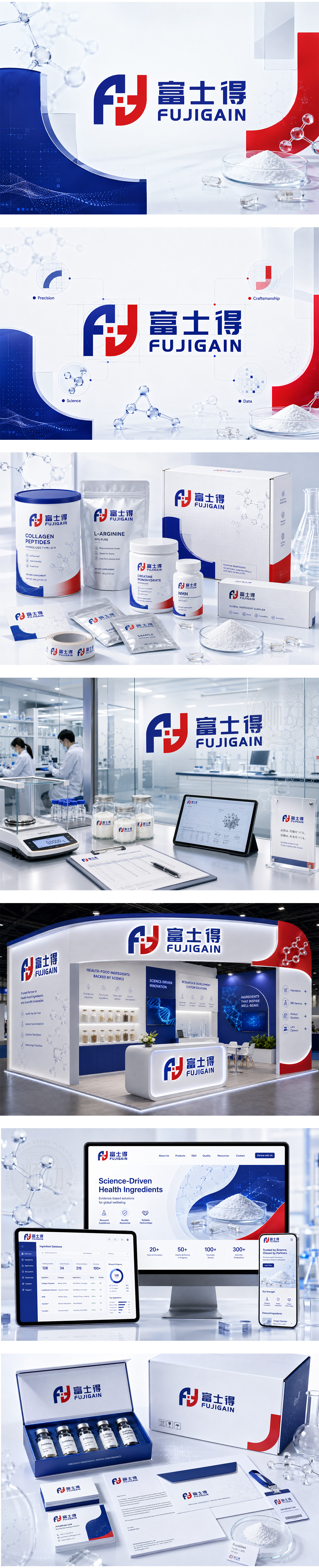
标志以红蓝双色融合“F”与“J”字母,构成对称互锁结构,象征科技协作与品质共生。中间十字节点寓意精准研发与健康守护,契合保健品原料行业对安全、高效、创新的追求。下方“FUJIGAIN”与“富士得”字体稳重清晰,传递专业与国际视野。整体视觉平衡有力,体现企业以科学驱动、以健康为本的核心价值。
The logo merges “F” and “J” in red and blue to form a balanced, interlocking structure — symbolizing scientific collaboration and quality synergy. The central cross-node represents precision R&D and health guardianship, core to nutraceutical ingredient innovation. “FUJIGAIN” and its Chinese counterpart are rendered in clean, authoritative typefaces, reinforcing professionalism and global reach. Visually cohesive and purposeful — reflecting a brand built on science, safety, and wellness-driven values.




扫码或拨打添加客服微信


