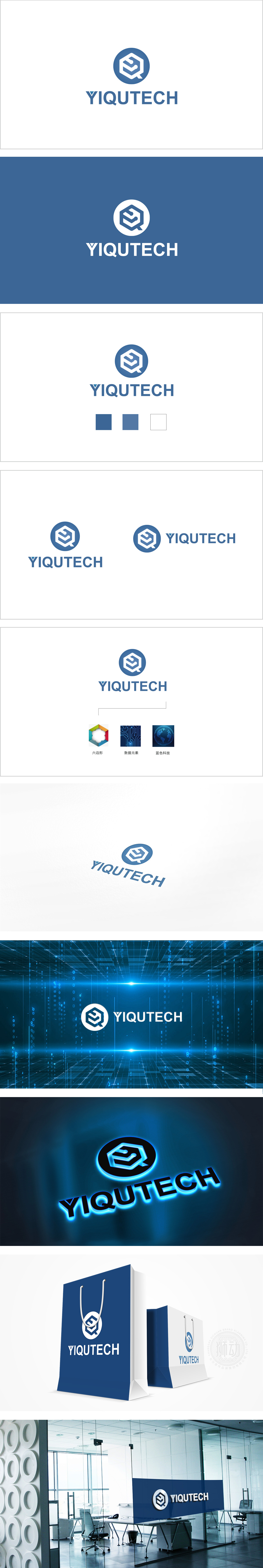
狮动设计以“Q”元素与上方的曲线线条形成记忆点,也暗合科技领域“探索”“问答”的交互属性,简约大气的“YIQUTECH”英文标识,国际范十足,蓝色调传达专业、可靠、科技的品牌形象,整体传递出清晰的科技品牌定位。这种将行业特性、品牌基因与视觉符号高度融合的设计,确实展现了对图形语言的精准把控,让人印象深刻。
Lion Design forms a memory point with the "Q" element and the upper curve and line, and also coincides with the interactive attributes of "exploration" and "question and answer" in the field of science and technology. The simple and atmospheric English logo of "YIQUTECH" is full of international norms, and the blue tone conveys a professional, reliable and technological brand image, thus conveying a clear scientific and technological brand positioning as a whole. This highly integrated design of industry characteristics, brand genes and visual symbols really shows the precise control of graphic language, which is impressive.


扫码或拨打添加客服微信


