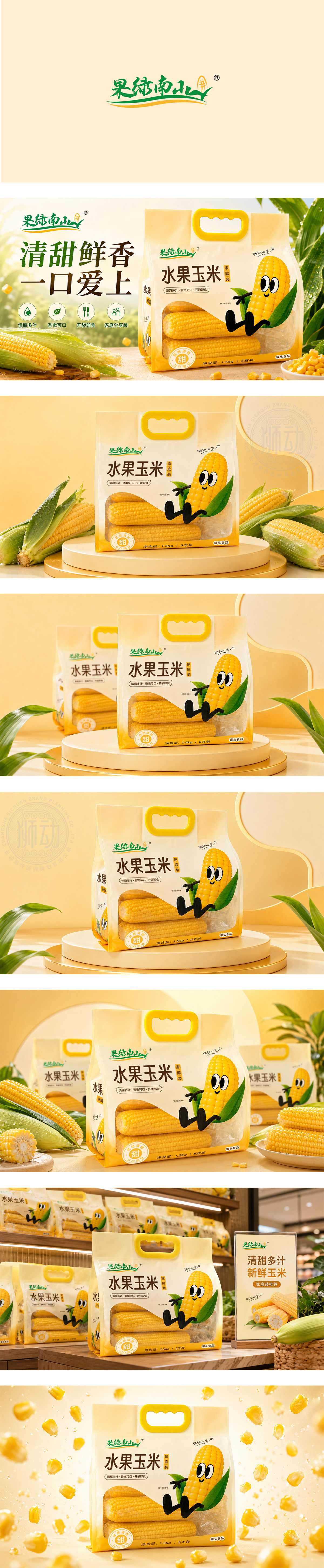
水果玉米包装以暖黄+鲜绿为主色调,呼应玉米自然属性。手提设计提升便携性,卡通玉米形象活泼亲和,传递“清甜多汁”的产品特质;“家庭装”定位清晰,透明视窗直观呈现内容物。品牌“果纯南山”以手写字体+玉米图形强化记忆,整体风格清新明快,适配生鲜品类的天然、美味联想,精准触达家庭消费与年轻客群。
This fruit corn package adopts warm yellow & fresh green to reflect corn’s natural essence. A handy handle boosts portability, and a playful cartoon corn character delivers “crisp, sweet, juicy” vibes. The “family pack” is clear, with a transparent window for content visibility. The brand logo (with corn motif + handwritten - style text) reinforces recognition. The fresh, lively design aligns with fresh produce’s natural appeal, targeting families and young buyers.




扫码或拨打添加客服微信


