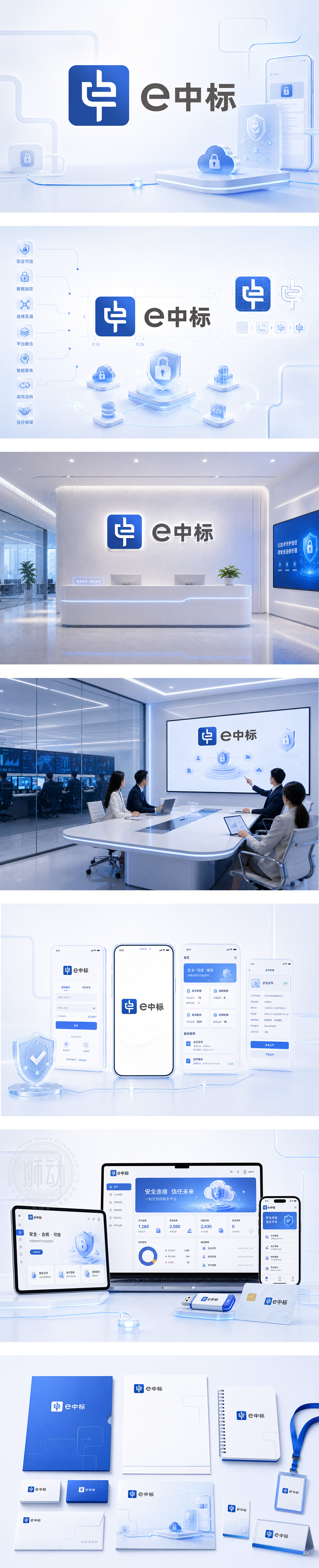
标志以蓝色科技方块为底,内嵌抽象“中”字与电路线条融合,象征本土化数字信任与加密安全;右侧“e中标”采用现代无衬线字体,“e”代表电子化,“中标”直指核心业务。整体简洁理性、专业可信,契合电子招投标平台、密码认证系统或政企数字化采购领域,传达“安全高效,一击即中”的品牌承诺。
The logo features a blue tech square embedding an abstract “Zhong” character merged with circuit-like lines — symbolizing localized digital trust and cryptographic security. To the right, “e中标” (rendered as “eWinBid” conceptually) uses clean sans-serif typography: “e” for electronic, “WinBid” for successful bidding. Minimalist, rational, and authoritative — it embodies “Secure. Efficient. One-Click Win.” — ideal for e-bidding platforms, password authentication systems, or government digital procurement services.




扫码或拨打添加客服微信


