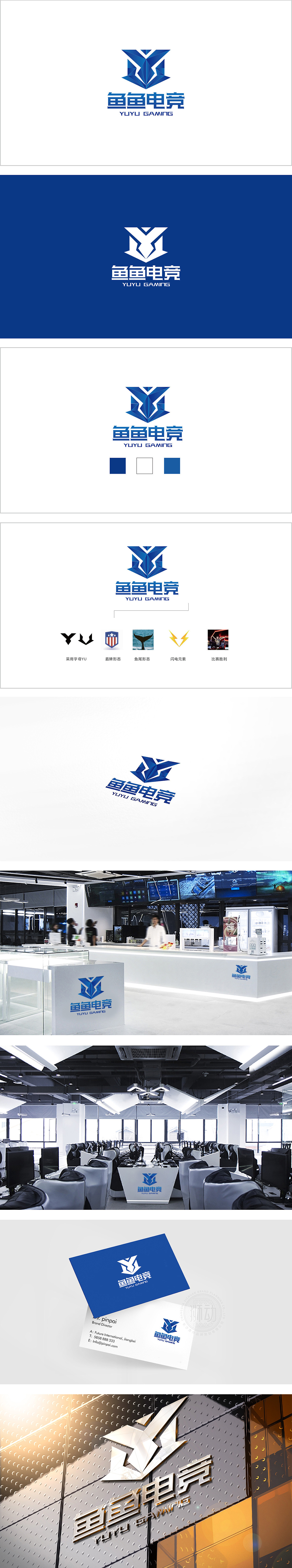
狮动设计以品牌名称“YUYU”中的首字母“Y”为视觉核心,通过几何切割与锐角造型构建出强烈的电竞专属气质:顶部“Y”的两侧锐角向上延伸,呈“冲刺”或“突破”姿态,呼应电竞中“竞技对抗”的张力,类似游戏角色技能释放时的“能量爆发”轨迹,双“Y”融合:底部对称的“Y”形结构暗藏品牌名“YUYU”的重复韵律,同时通过叠加形成类似电竞战队队徽常见的双生/协作符号,象征团队配合与竞技凝聚力通过“Y”形竞技内核+盾牌战队符号+闪电速度基因+鱼尾品牌差异化的四重结合,既满足了电竞用户对“力量、速度、胜利”的视觉期待,又以“鱼”元素赋予品牌独特记忆点,有利于品牌传播。
Lion design takes the initial letter "Y" in the brand name "YUYU" as the visual core, and constructs a strong e-sports exclusive temperament through geometric cutting and acute modeling: the acute angles on both sides of the top "Y" extend upward, showing a "sprint" or "breakthrough" posture, echoing the tension of "competitive confrontation" in e-sports, similar to the "energy burst" trajectory when the skills of game characters are released, and double "Y"Through the four-fold combination of Y-shaped competitive core+shield team symbol+lightning speed gene+fishtail brand differentiation.


扫码或拨打添加客服微信


