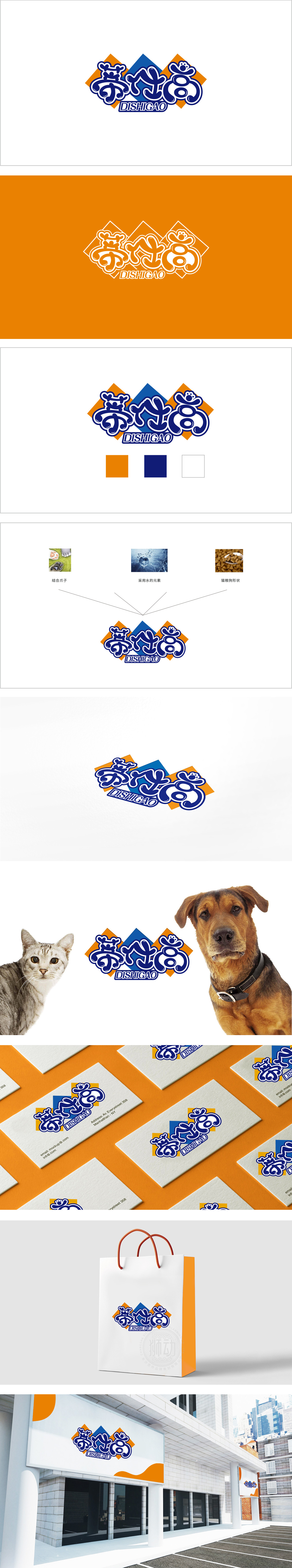
狮动设计采用圆润、流畅的手写体设计,笔画末端带有类似“爪印”“绒毛”的卷曲线条,直观传递出宠物食品的“可爱”“友好”属性,贴合宠物主人对产品“温暖、亲切”的心理期待。色彩系统的情感暗示:橙色:象征活力、食欲与温暖,符合宠物食品需要激发宠物兴趣、传递“美味”“营养”的核心诉求;蓝色:代表安全、专业与信任”,暗示品牌在配方、品质上的可靠性,平衡“感性吸引”与“理性信任”。通过萌系符号、情感化色彩、结构化布局的组合,既满足了“吸引宠物主人注意力”的营销需求,又通过专业色彩(蓝色)和稳定结构传递了“可靠”的品牌形象。
Lion design adopts round and smooth handwriting design, with curly lines similar to "paw prints" and "fluff" at the end of strokes, which intuitively conveys the "cute" and "friendly" attributes of pet food and fits the pet owner's psychological expectation of "warmth and kindness" of products. Emotional suggestion of color system;Orange symbolizes vitality, appetite and warmth, and meets the core demands of pet food to stimulate pet interest and convey "delicacy" and "nutrition"; Blue: stands for safety, professionalism and trust ",implying the reliability of the brand in formula and quality, and balancing" perceptual attraction "and" rational trust ".


扫码或拨打添加客服微信


