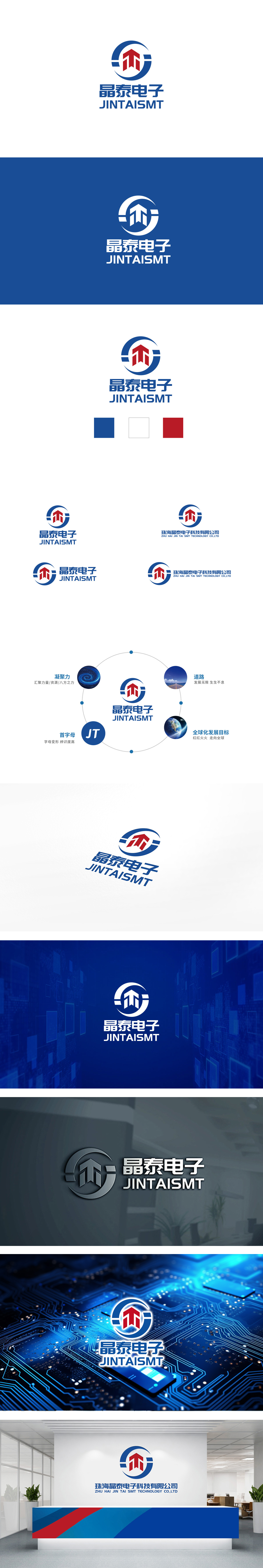
狮动设计以流畅的曲线构成,象征企业的全球化视野、包容性与完整性,环形的闭合感也传递出“精益求精、闭环管理”的工匠精神,符合电子制造行业对精密、可靠的核心诉求。向上的“箭头”形似“M”字母,整体呈现三角形稳定性结构,传递出企业坚实的技术根基与行业地位。红色箭头的向上倾斜趋势,强烈表达“积极进取、追求卓越、持续增长”的品牌愿景,红色作为高辨识度色彩,也增强了视觉冲击力和记忆点。LOGO整体风格简洁、大气、国际化,适合电子制造企业“技术严谨+市场进取”的双重需求。
Lion design is composed of smooth curves, which symbolizes the global vision, inclusiveness and integrity of the enterprise. The circular sense of closure also conveys the craftsman spirit of "Excellence and closed-loop management", which meets the core demands of the electronics manufacturing industry for precision and reliability. The upward "arrow" is shaped like an "M" letter, showing a triangular stability structure as a whole, conveying the firm technical foundation and industry position of the enterprise. The upward sloping trend of the red arrow strongly expresses the brand vision of "being aggressive, pursuing Excellence and sustained growth".


扫码或拨打添加客服微信


