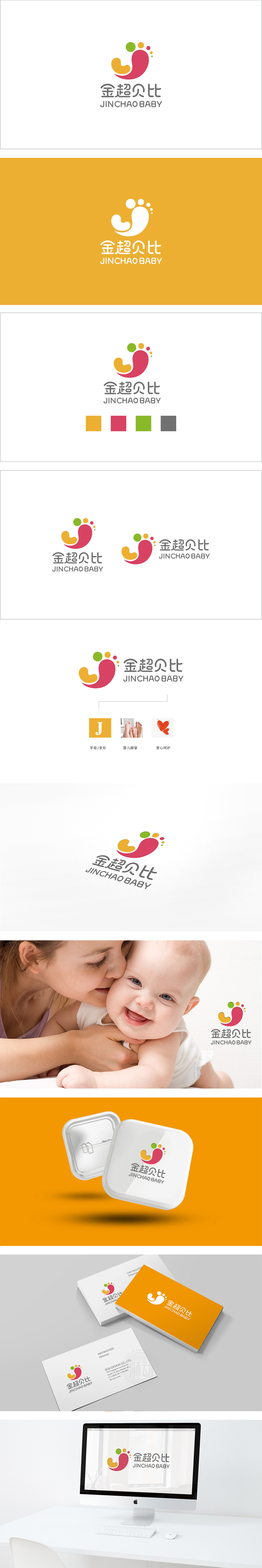
狮动设计以卡通化的婴儿足印为核心,足部线条圆润柔和,脚趾简化为色块,保留了婴儿脚丫的萌趣特征,足部后方延伸出的粉色弧形线条,形似一只温柔的手轻轻环绕,抽象化为母婴间的“拥抱”姿态,直观传递“守护、陪伴、关爱”的品牌理念,彩色圆点:象征“成长印记”与活力,整体通过“符号即故事”的图形语言,将“婴儿”“呵护”“成长”三大核心要素浓缩为直观的视觉符号:足印代表“宝宝”,环抱线条代表“母爱/呵护”,彩色圆点代表“活力与成长”,三者协同构建了“金超贝比”作为“母婴生活伙伴”的品牌形象。
Lion design takes the cartoon baby footprint as the core, the foot lines are round and soft, and the toes are simplified into color blocks, which retains the cute and interesting characteristics of the baby's feet. The pink arc lines extending from the back of the feet are like a gentle hand gently encircling, abstracting into a "hug" gesture between the mother and the baby, intuitively conveying the brand concept of "guarding, accompanying and caring", and the colored dots symbolize "growth marks" and vitality, which are passed as a whole. The three core elements of "baby", "care" and "growth" are condensed into intuitive visual symbols.


扫码或拨打添加客服微信


