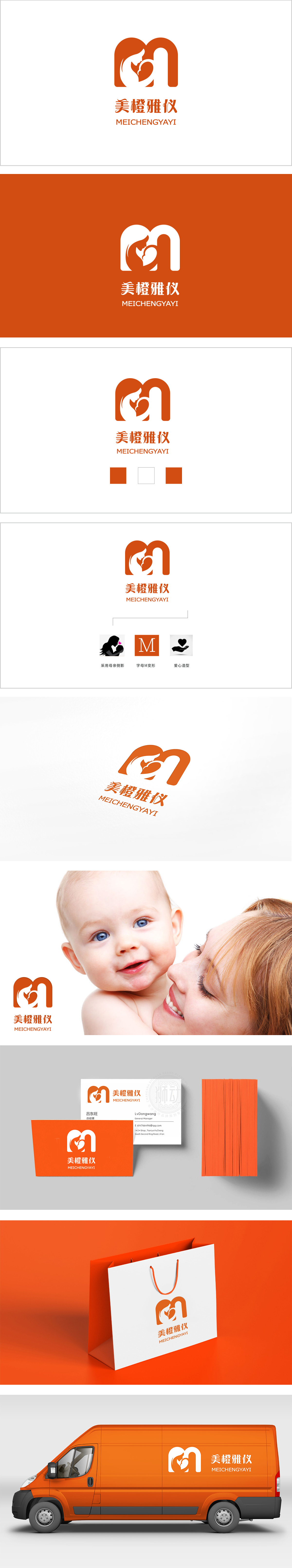
狮动设计以“母爱”为核心的视觉符号,字母“M”的意象化设计,整体外轮廓是一个抽象的橙色字母“M”,既是“Mother(母亲)”的首字母,也可能关联品牌名称中的“美(Měi)”,直接点明服务对象与核心场景。橙色作为主色调,传递温暖、亲切、活力的感觉,符合月子中心对“安心、舒适”的氛围定位,同时橙色也象征健康与新生,贴合母婴关怀的主题。母婴相拥的剪影嵌套,既突出了“母爱”“呵护”的核心情感,又通过留白增强了画面的呼吸感和故事性。这种“外轮廓沉稳包裹,内细节温情流动”的设计,直观传递出月子中心“专业守护、温馨陪伴”的服务理念。
Lion design takes "maternal love" as the core visual symbol and the letter "M" as the imagery design.The overall outline is an abstract orange letter "M", which is not only the initial letter of "Mother", but also may be associated with "Měi" in the brand name, directly pointing out the service object and the core scene. As the main color, orange conveys the feeling of warmth, kindness and vitality, which conforms to the atmosphere positioning of "peace of mind and comfort" in Yuezi Center. At the same time, orange also symbolizes health and rebirth.


扫码或拨打添加客服微信


