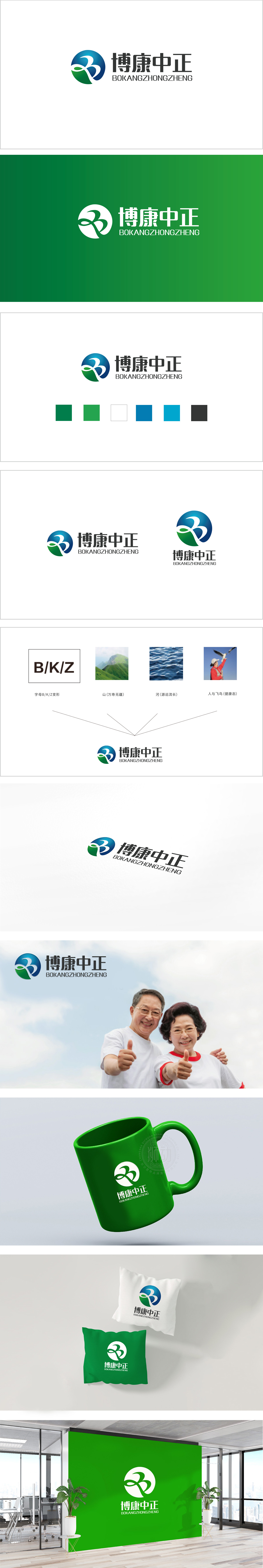
狮动设计以抽象化的“人”形线条与环形结构组成:双“人”互动:既像子女对长辈的陪伴,也象征养老服务中“专业照护”与“情感支持”的双重守护,呼应养老场景中“不孤独”的核心需求。蓝绿色渐变的圆形背景形成包围式结构,传递“全方位守护”的视觉隐喻,整体用流动的形态打破养老的刻板印象,用平衡的色彩传递专业与温暖,最终通过“无龄感”的视觉语言,构建了一个既强调“安全守护”又倡导“积极生活”的养老品牌形象。
Lion design is composed of abstract "human" lines and circular structure: double "human" interaction: it is not only like children accompanying their elders, but also symbolizes the double protection of "professional care" and "emotional support" in the old-age service, echoing the core demand of "not being lonely" in the old-age scene. The gradual blue-green circular background forms an enclosed structure, conveying the visual metaphor of "all-round protection", breaking the stereotype of old-age care with a flowing form as a whole.


扫码或拨打添加客服微信


