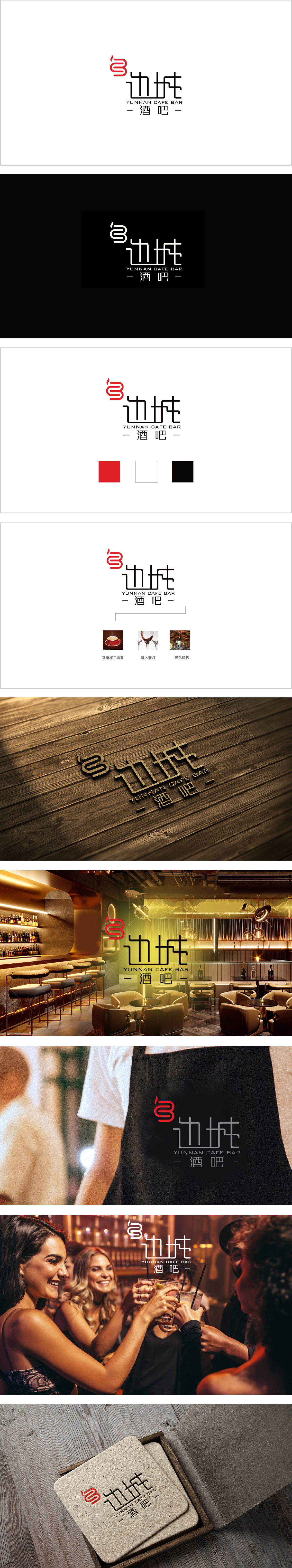
狮动设计将“边”字拼音首字母“B”为骨架,通过流畅的红绸式曲线环绕、堆叠,形成类似“流动的边界”视觉效果,既呼应“边城”的“边”字,又传递出地域文化中开放、交融的特质。火焰/热忱的隐喻:用红色强化了温暖、热情的氛围,既贴合酒吧作为社交空间的属性,也暗合云南少数民族文化中“火”的象征意义,赋予品牌鲜活的情感温度。字体保留了手写书法的顿挫感,横画、竖画略带倾斜,撇捺舒展却不张扬,传递出“边城”的人文气息——既有边陲小镇的质朴,又不失文化底蕴,通过视觉符号讲述了“一个有文化底蕴、热情开放的咖啡酒吧”的故事。
Lion Design takes the initial letter "B" of the word "Bian" as the skeleton, and forms a visual effect similar to "flowing boundary" or "winding ribbon" through smooth red silk curves, which not only echoes the word "Bian" of "Border Town", but also conveys the characteristics of openness and blending in regional culture. Metaphor of Fire/Enthusiasm: Red strengthens the warm and enthusiastic atmosphere, which not only fits the attribute of bar as a social space, but also coincides with the symbolic meaning of "fire" in Yunnan minority culture, giving the brand fresh emotional temperature. The font retains the sense of frustration of handwritten calligraphy, and the horizontal and vertical paintings are slightly inclined, but they are stretched without publicity.


扫码或拨打添加客服微信


