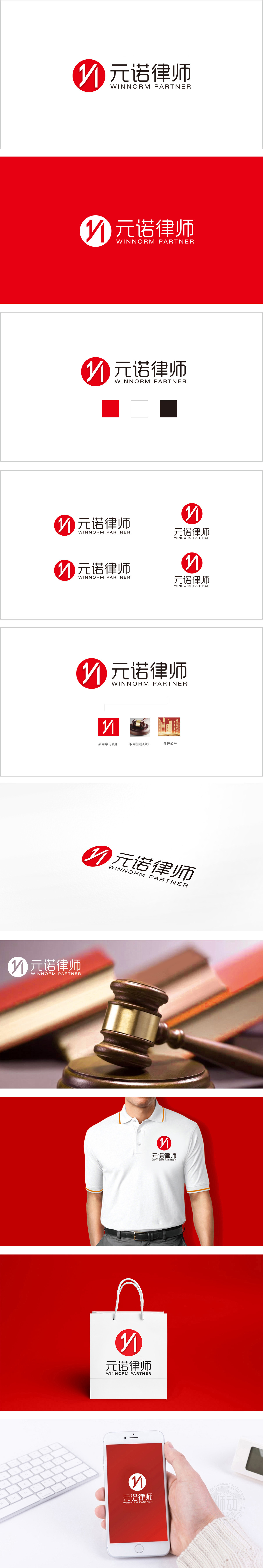
狮动设计采用首字母“Y”和“N”的融合设计,竖线与斜线构成“Y”的主体框架,延伸的折线巧妙融入“N”的形态,形成“一笔连贯”的视觉效果,既简洁抽象,又暗含品牌名称的文字基因。线条的锐角处理,传递出力量感与专业性,符合律师行业“严谨、锐利、解决问题”的职业属性,实现刚柔平衡。红色在视觉中具有高辨识度和冲击力,常与“权威、信任、活力”相关联,强化了法律服务的公信力与责任感。中文“元诺律师”:传统与现代的平衡,暗示律师行业“以规范为准则,为客户争取胜诉”的核心目标,又赋予品牌国际化的语感,传递“专业能力与全球视野”的定位。
Lion Design adopts the fusion design of initials "Y" and "N", vertical lines and diagonal lines form the main frame of "Y", and the extended broken lines are skillfully integrated into the shape of "N" to form a "coherent" visual effect, which is concise and abstract, but also implies the literal genes of brand names. The acute angle treatment of lines conveys the sense of output and professionalism, which conforms to the professional attribute of "rigor, sharpness and problem solving" in the lawyer industry and realizes the balance between rigidity and flexibility.


扫码或拨打添加客服微信


