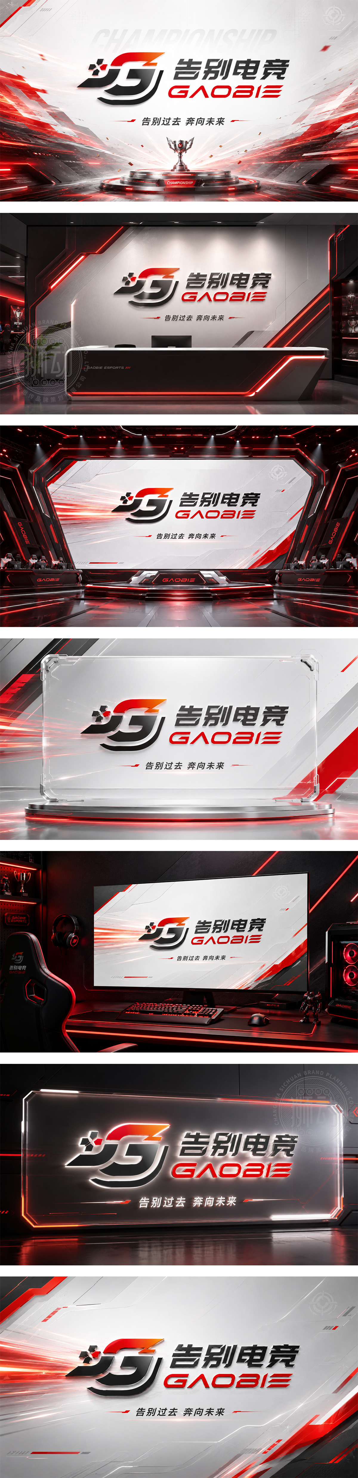
标志以品牌首字母“G”与“B”为骨架,通过极具张力的斜切线条,构建出一个极速冲刺的动态造型,仿佛一道闪电划破夜空,寓意着与过去电竞生涯的激烈切割。左上角的碎裂红光与主体的深灰形成强烈对比,既象征着热血记忆的消散,也暗示着新生的开始。整体设计充满竞技的速度感与决绝的力量,完美契合了“告别电竞”这一充满故事性的品牌主题。
The logo uses the initials "G" and "B" as its framework, creating a high-speed, dynamic shape with sharp diagonal cuts that mimic a lightning bolt—symbolizing a fierce break from the past. The scattered red light against the dark grey represents the dissipation of passion and the dawn of a new beginning. This design perfectly captures the intense speed and decisive power of the brand theme "Farewell E-sports."




扫码或拨打添加客服微信


