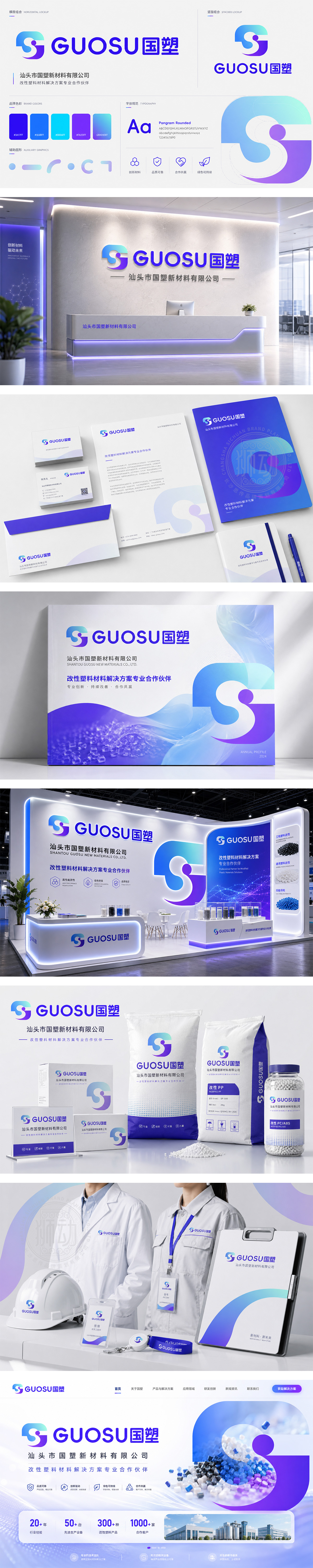
标志以品牌首字母“G”与“S”为设计核心,通过流畅的线条相互交融,构建出一个稳固且富有动感的几何形态,象征企业发展的坚实根基与持续创新的活力。图形巧妙融入渐变色彩,从深邃的紫蓝过渡到清透的青蓝,寓意科技与未来的无限可能。整体造型现代简约,兼具国际化的视觉张力,精准传达了“国塑”作为行业标杆,致力于塑造高品质未来的品牌愿景。
The logo centers on the brand initials "G" and "S," interlocking to form a stable yet dynamic geometric shape, symbolizing a solid foundation and continuous innovation. The gradient of deep purple-blue to clear cyan-blue suggests infinite possibilities in technology and the future. With a modern, minimalist aesthetic and international visual appeal, it perfectly conveys GUOSU's vision of shaping a high-quality future as an industry leader.




扫码或拨打添加客服微信


