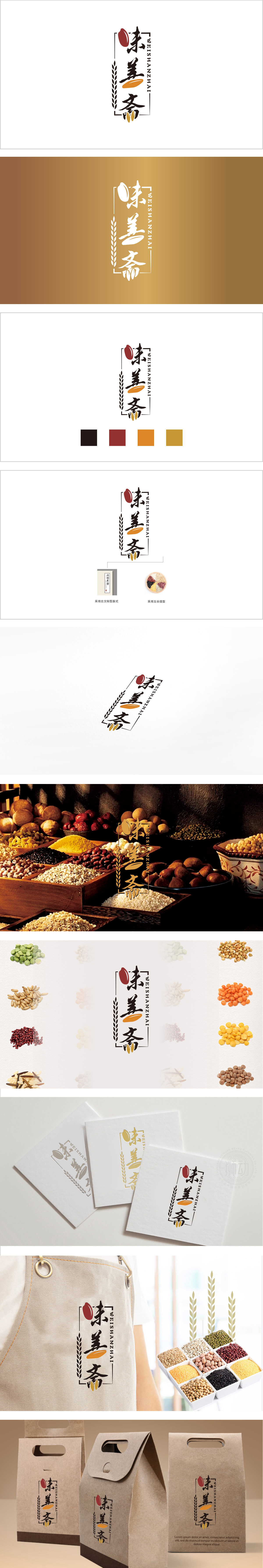
狮动设计以竖排“味善斋”三个书法字体为核心,字形采用楷书与行书结合的笔触,既有楷书的稳健端庄,又有行书的灵动飘逸,传递出传统与人文的温度。既强化了书法字的书卷气,又通过“不闭合”的设计打破沉闷,形成“传统而不刻板”的视觉印象。麦穗(谷物)+ 谷粒(食材)+ 书法字(文化)的组合,构建了“从食材到文化”的完整叙事:书法字与边框传递“传统工艺”“匠心制作”的品牌调性,红色圆点(“味”字点睛)则暗喻“味”是核心竞争力——既有食材的本味,也有制作者的心意,传统与现代的“轻中式”设计典范。
Lion design takes the vertical three calligraphy fonts "Weishanzhai" as the core, and the font adopts the combination of regular script and running script, which not only has the stability and dignity of regular script, but also has the agility and elegance of running script, conveying the temperature of tradition and humanity. It not only strengthens the bookish spirit of calligraphy characters, but also breaks the dullness through the "not closed" design, forming a "traditional but not rigid" visual impression. The combination of ears of wheat (grain)+grains (food)+calligraphy characters (culture) constructs a complete narrative of "from food to culture".


扫码或拨打添加客服微信


