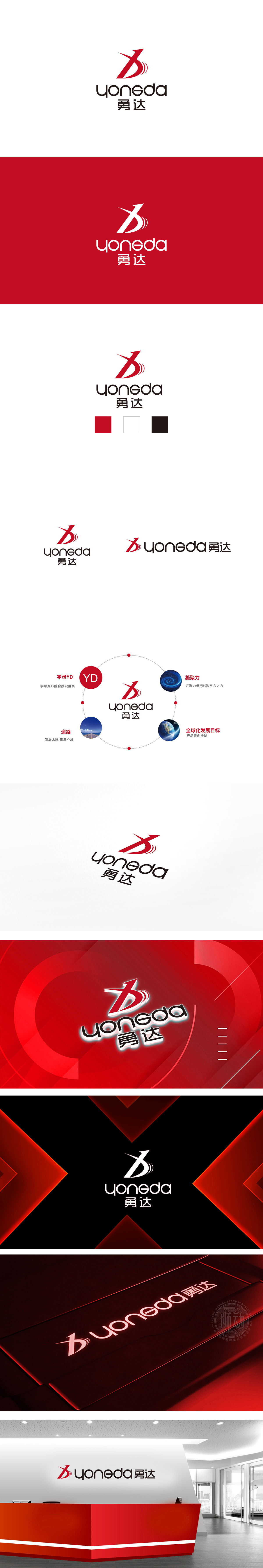
狮动设计采用红色抽象“箭头”造型,由斜向直线与右侧曲线组合而成,既像向上的箭头(象征“进取”“突破”),又隐含字母“Y”的变形,实现品牌名与视觉符号的关联。红色曲线与渐变线条,增强了动态感,仿佛物体高速移动时的残影,传递“速度”“活力”的品牌调性。红色作为主色调,传递热情、能量、行动力,符合“勇达”名称中“勇”所蕴含的果敢、坚毅特质。整体将“勇达”的“勇”(行动力)与“达”(目标感)通过图形符号(箭头)和文字结构(稳定+动态)具象化,实现“名-形-意”的统一。
Lion design adopts red abstract "arrow" shape, which is composed of oblique straight line and right curve. It is not only like an upward arrow (symbolizing "enterprising" and "breakthrough"), but also implies the deformation of the letter "Y", realizing the association between brand name and visual symbols. Red curves and gradient lines enhance the sense of dynamic, just like the afterimage of objects moving at high speed, conveying the brand tonality of "speed" and "vitality". Red, as the main color, conveys enthusiasm, energy and action, which conforms to the bold and determined characteristics of "Yong" in the name of "Yong Da".


扫码或拨打添加客服微信


