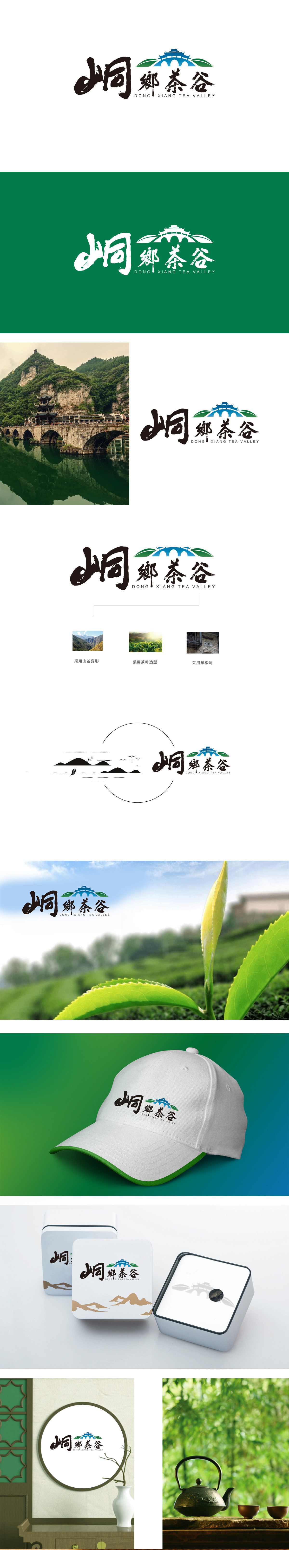
狮动设计以“中式建筑+桥梁”意象:融合人文与自然景观,蓝色城楼与拱桥的组合,既是传统中式建筑的缩影,也象征“连接”——桥连接山水与村落,建筑连接历史与当下,蓝色调传递出清新、宁静的自然氛围,符合茶谷“生态康养”的潜在定位。绿叶作为茶产业的直接符号,不仅明确“茶谷”的核心产业,形成“以茶为媒,以旅为径”的产业链延伸。“峒鄉茶谷”的LOGO通过“地域文化符号(峒)+核心产业(茶)+景观载体(建筑/绿叶)”的三重绑定,快速建立一个有古村落、有茶山、有少数民族文化的生态茶乡”品牌认知。
Liondesign uses the image of "Chinese architecture+bridge": integrating humanities and natural landscape.The combination of blue tower and arch bridge is not only the epitome of traditional Chinese architecture, but also a symbol of "connection"-the bridge connects mountains and rivers with villages, and the building connects history with the present. The blue tone conveys a fresh and quiet natural atmosphere, which is in line with the potential positioning of "ecological health" in Tea Valley. As a direct symbol of tea industry, green leaves not only define the core industry of "tea valley", but also form an industrial chain extension of "taking tea as the medium and taking travel as the path".


扫码或拨打添加客服微信


