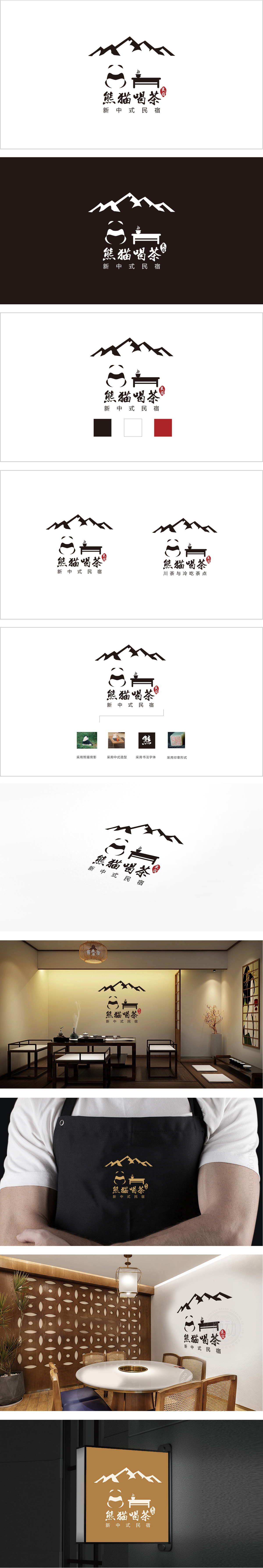
狮动设计以极简的几何图形构成熊猫的头部轮廓,形成高度概括的识别符号,憨态可掬的形象传递出亲和力。熊猫右侧是一张中式长桌,桌上放置一杯冒着热气的茶,场景化元素直接点出“喝茶”的核心体验,同时“茶”作为中式文化的典型载体,强化了品牌的文化属性。熊猫与茶桌的组合形成“人在景中、景中有茶”的画面,暗喻民宿“闲适、慢生活”的场景联想。整体以“极简图形+现代字体+传统符号点睛”的方式,将熊猫的现代萌感、茶的传统底蕴、山的自然意境融为一体,实现了“传统为体,现代为用”的视觉转化,传递出“自然、闲适、有文化温度”的民宿气质。
Lion design forms the outline of the panda's head with minimalist geometric figures, forming a highly generalized identification symbol, and the naive image conveys affinity. On the right side of the panda is a long Chinese table with a steaming cup of tea on it. The scene elements directly point out the core experience of "drinking tea". At the same time, "tea" as a typical carrier of Chinese culture strengthens the cultural attributes of the brand. The combination of panda and tea table forms a picture of "people in the scenery and tea in the scenery", which is a metaphor for the scene association of "leisure and slow life" in the hotel.


扫码或拨打添加客服微信


