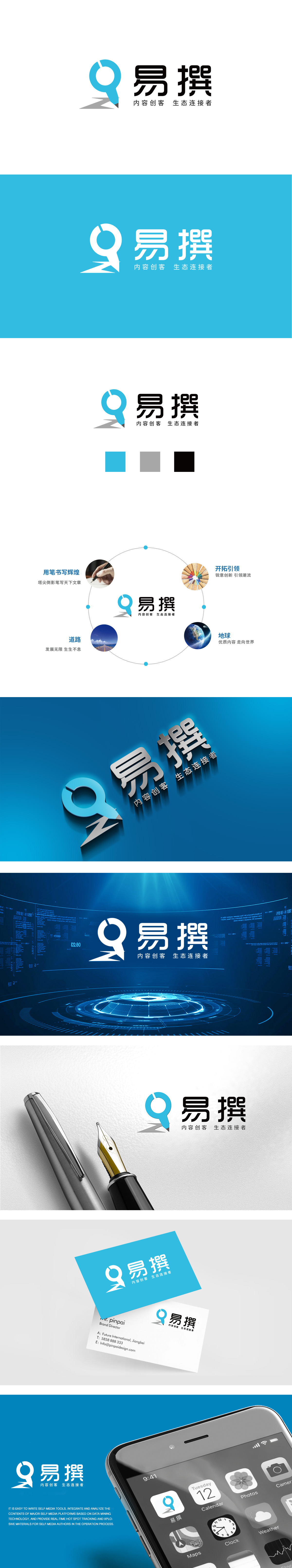
狮动设计采用蓝色圆形为主体,巧妙融合了“放大镜”与“笔尖”的意象:笔尖延伸的灰色线条低调沉稳,与蓝色形成对比又不冲突,既强化了“笔尖”的质感,也象征内容创作的“沉淀”与“务实”,圆形与缺口设计:完整圆形象征“探索、聚焦”(放大镜的功能联想),隐喻“从发现到突破”的创作过程,呼应内容创作中“挖掘价值、输出观点”的核心动作。整体传递了“内容创客”与“生态连接者”的核心定位,展现出清晰的品牌逻辑与视觉美感。
Lion design takes the blue circle as the main body, and skillfully blends the images of "magnifying glass" and "nib": the gray lines extended by the nib are low-key and steady, which are in contrast with the blue color without conflict, which not only strengthens the texture of the nib, but also symbolizes the "precipitation" and "pragmatism" of content creation. The design of circle and gap: the complete circle symbolizes "exploration and focus" .


扫码或拨打添加客服微信


