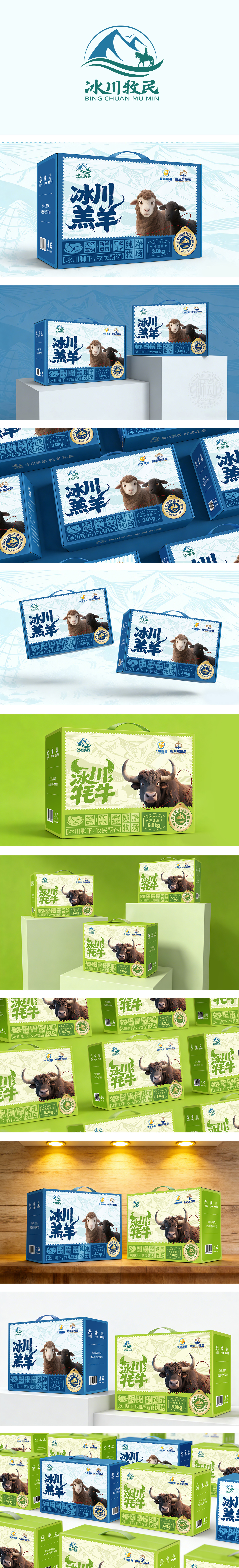
狮动设计采用“冰川脚下·牧民甄选”为核心主题,通过统一的视觉语言强化品牌辨识度:背景元素:冰川山脉插画(线条简洁、色调柔和),搭配“冰川牧民”LOGO(雪山+太阳+云朵),直接关联“高海拔、纯天然”的产地属性;品牌标识:以蓝白为主调(浅蓝+米白),模拟冰川的清透感,符合“羔羊”的“鲜嫩、纯净”属性;核心元素:卡通化的黑白羔羊插画(棕白相间的绵羊+黑色羔羊),形象软萌可爱,传递“温顺、新鲜”的印象;细节符号:底部用蓝色标签标注“冰川牧场”,搭配“天然草饲、新鲜原切、鲜嫩香浓”等关键词,强化“羔羊”的细腻口感。通过“统一品牌记忆”+“差异化产品识别”+“高效信息传递”+“情感信任建立”,完美实现了“让用户快速理解、相信并选择”的目标,尤其适合注重健康、喜欢天然食品的家庭用户。
Lion Design adopts the core theme of "Selection of Herdsmen at the Foot of Glacier", and strengthens the brand recognition through unified visual language * *: Background elements: all of them adopt light illustrations of Glacier Mountains (with simple lines and soft colors), and match with the LOGO of "Glacier Herdsmen" (snow mountain+sun+clouds), which directly relates to the origin attribute of "high altitude and pure nature";Brand logo: blue and white is the main tone (light blue+off-white), which simulates the clear feeling of glaciers and conforms to the "fresh and pure" attribute of "lamb";Core elements: cartoon black and white lamb illustration (brown and white sheep+black lamb), the image is soft and cute, conveying the impression of "docile and fresh"; Detail symbol: The bottom is marked with blue label "Glacier Ranch", with keywords such as "natural grass feed, fresh raw cut, fresh and tender" to enhance the delicate taste of "Lamb". Through "unified brand memory"+"differentiated product identification"+"efficient information transmission"+"emotional trust establishment", the goal of "letting users quickly understand, believe and choose" is perfectly realized, especially suitable for family users who pay attention to health and like natural food.


扫码或拨打添加客服微信


