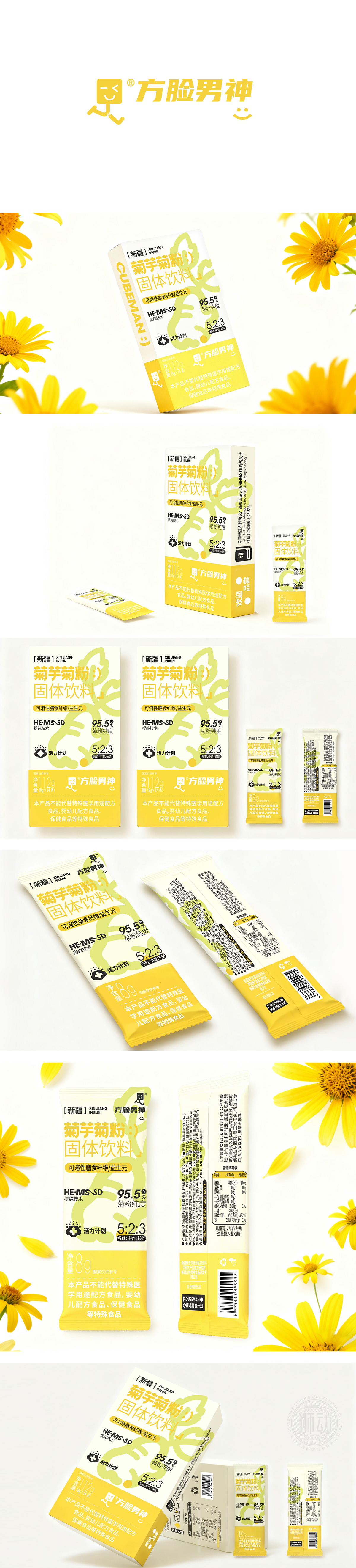
狮动设计用“「自然+科技」双标签”锚定产品定位,是通过视觉符号强化“天然原料+科学提纯”的核心卖点——既突出菊芋(新疆产地)的自然属性,又用技术参数(95.5%纯度、HE-MS®D提纯技术)建立专业感,解决消费者对“菊粉品质”的核心顾虑。黄色+白色,用“自然联想”强化产品记忆。黄色:取“菊芋花”“菊花”的天然色,直接关联原料(菊芋),同时黄色能激发“活力、健康”的情绪(符合“活力计划”的产品主题);白色:作为底色,降低视觉负担,让黄色元素更突出,同时传递“干净、纯粹”的质感(呼应“95.5%高纯度”的卖点)。两者搭配既“接地气”(自然原料),又“有调性”(现代健康食品),符合大众对“健康饮品”的视觉期待。每一个元素都在“为产品说话”——既好看(视觉吸引力强),又好用(信息传达高效),完美匹配“健康食品”的定位和目标人群的需求。
Lion design uses low saturation macaroon color (light pink+light blue) to create a warm atmosphere, and uses Q cartoon image to simulate the feeling of "pet companion", so that the owner can associate the happy appearance of his pet when he sees the package. Light pink (background check)+light blue (background color of main screen)+off-white (pet subject) are all "soft colors" with low saturation, as soft as cotton candy, which accords with the tonality of "warmth and safety" of pet products. Light powder can stimulate "maternal love", while light blue brings a "refreshing" feeling to avoid being too sweet and greasy. It is not only "beautiful", but also "understands users"-understands the emotional needs of pet owners, the dietary needs of pets, and the communication needs of brands.


扫码或拨打添加客服微信


