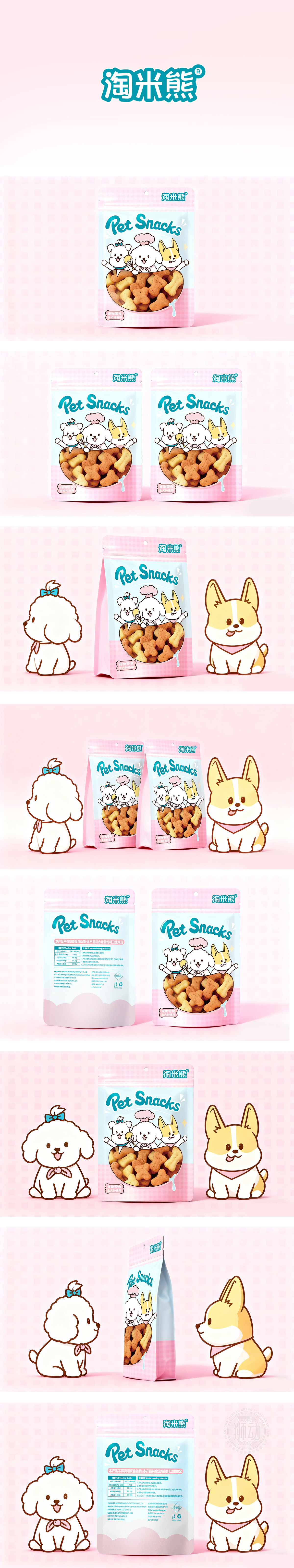
狮动设计用低饱和度的马卡龙色(浅粉+浅蓝)营造温馨氛围,用Q版卡通形象模拟“宠物伙伴”的感觉,让主人看到包装就联想到自己宠物吃零食时的开心模样。浅粉(背景格子)+浅蓝(主画面底色)+米白(宠物主体),都是低饱和度的“软色”,像棉花糖一样柔和,符合宠物产品“温暖、安全”的调性。浅粉能激发“母爱”,浅蓝则带来“清爽”感,避免过于甜腻。它不仅“好看”,更“懂用户”——懂养宠人的情感需求,懂宠物的饮食需求,懂品牌的传播需求。这就是好设计的力量。
Lion design uses low saturation macaroon color (light pink+light blue) to create a warm atmosphere, and uses Q cartoon image to simulate the feeling of "pet companion", so that the owner can associate the happy appearance of his pet when he sees the package. Light pink (background check)+light blue (background color of main screen)+off-white (pet subject) are all "soft colors" with low saturation, as soft as cotton candy, which accords with the tonality of "warmth and safety" of pet products. Light powder can stimulate "maternal love", while light blue brings a "refreshing" feeling to avoid being too sweet and greasy. It is not only "beautiful", but also "understands users"-understands the emotional needs of pet owners, the dietary needs of pets, and the communication needs of brands. This is the power of good design.


扫码或拨打添加客服微信


