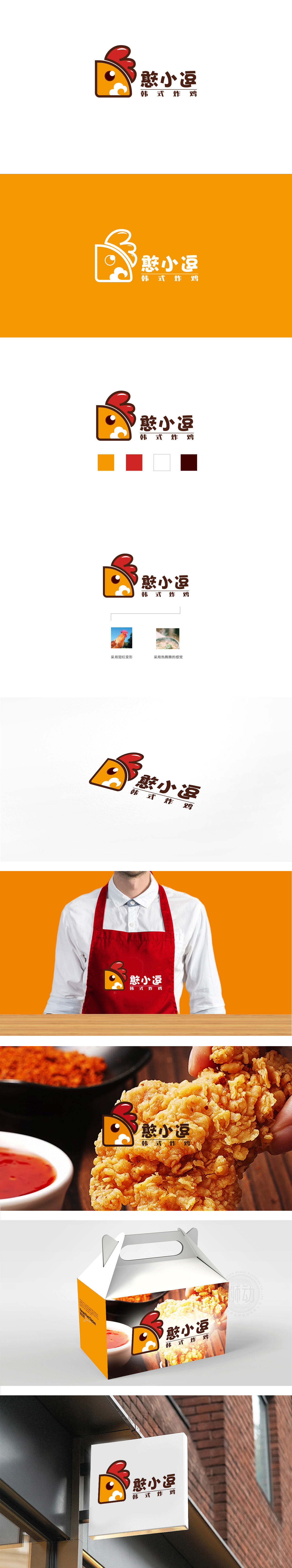
狮动设计以半侧面鸡头为核心,采用圆角矩形外框包裹,形成“局部聚焦”的视觉效果,既简化了形象,又突出了品牌核心元素(鸡)。鸡冠用三层渐变红色波浪纹设计,线条圆润且富有层次感,像火焰般向上扬起,既符合炸鸡的“热辣、酥脆”联想,又增添了活泼感;字体既有手写的温度感,又通过连笔和夸张结构强化了“逗趣、活泼”的品牌调性,与图形的萌系风格高度统一。“憨小逗”通过“萌系卡通+趣味命名”,打造了差异化的“亲民可爱”形象,更建立“有温度的快餐品牌”认知。
Lion design takes the half-side chicken head as the core and is wrapped by a rounded rectangular frame, which forms a visual effect of "local focus", which not only simplifies the image, but also highlights the core element of the brand (chicken).The comb is designed with three layers of gradual red wavy lines. The lines are round and layered, and they are lifted up like flames, which not only conforms to the association of fried chicken with "hot and crisp", but also adds a sense of liveliness. The font not only has a sense of handwriting temperature, but also strengthens the "funny and lively" brand tonality through Lian Bi and exaggerated structure.


扫码或拨打添加客服微信


