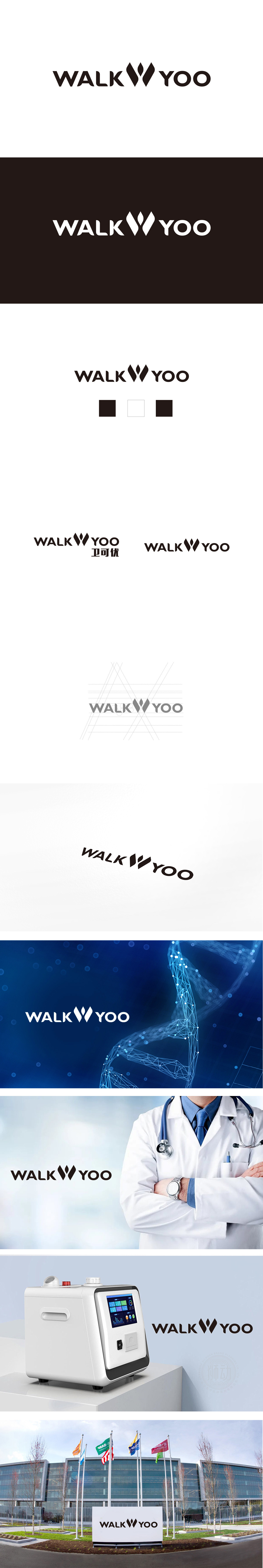
狮动设计将两片对称的叶片/羽翼形态,叠加中央的抽象“火苗/生命符号”,形成了多重意象:叶片/羽翼:常关联“自然”“健康”“呵护”,契合医疗健康领域对“生命守护”“自然疗愈”的价值传递;对称结构:传递稳定、专业感,符合医疗行业对“严谨”“可靠”的视觉需求;中央尖角元素:暗喻“生命力”“生长”“康复”,与医疗场景中“积极治疗”“健康向上”的核心诉求呼应。“WALK”(行走)与“YOO”的组合,传递出“陪伴行走”“助力健康生活”的品牌主张,整体黑白配色经典且中性,符合医疗行业“专业、冷静、可信赖”的视觉调性。用视觉讲“医疗故事”,传递:专业守护、生命关怀。
Lion design superposes two symmetrical leaf/wing shapes with the abstract "flame/life symbol" in the center, forming multiple images: the leaf/wing is often associated with nature, health and care, which is in line with the value transmission of life protection and natural healing in the medical and health field; Symmetrical structure: it conveys a sense of stability and professionalism, and meets the visual needs of the medical industry for "rigor" and "reliability"; Central sharp corner element: a metaphor for vitality, growth and recovery, which echoes the core demands of active treatment and healthy progress in medical scenes..


扫码或拨打添加客服微信


