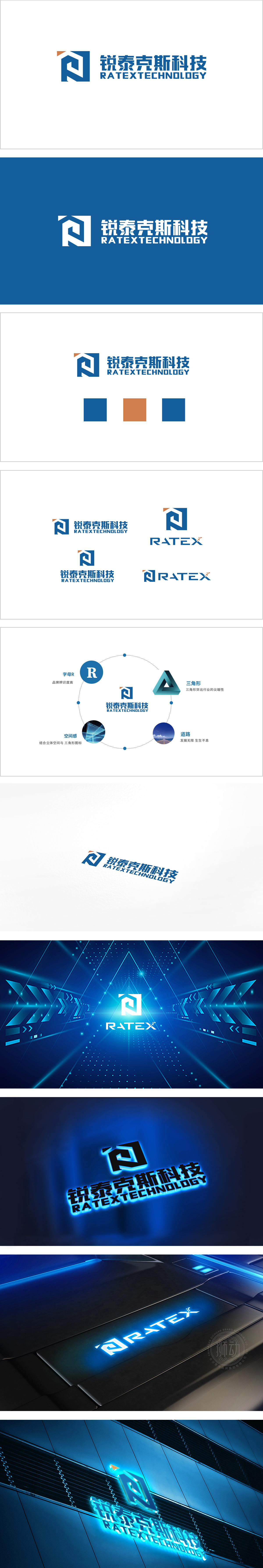
狮动设计以蓝色方形为基底,几何线条构成抽象的“R”,同时融入“T”的轮廓特征,形成“R+T”的双字母隐性关联,既强化品牌名称识别,又通过线条的交织传递“科技互联”的意象。方形框架象征稳定与专业,而内部倾斜的折线打破对称,注入动态感,体现科技企业的创新活力与突破精神。线条的穿插形成虚实相生的负空间,如同“灯塔”或“箭头”,隐喻企业在行业中的前瞻性与引领地位,同时提升整体造型的灵动性。整体设计围绕“专业、创新、引领、可靠”四个关键词展开:方形=专业可靠,折线=创新突破,蓝色=科技理性,橙色=引领活力,全方位塑造了一个“既有扎实技术底蕴,又具前沿探索精神”的科技品牌形象。
Lion design is based on a blue square, geometric lines constitute an abstract "R", and at the same time, it incorporates the outline features of "T" to form a double-letter implicit association of "R+T", which not only strengthens brand name recognition, but also conveys the image of "science and technology interconnection" through the interweaving of lines. The square frame symbolizes stability and professionalism, while the internal inclined broken line breaks the symmetry, injects a sense of dynamics, and embodies the innovative vitality and breakthrough spirit of science and technology enterprises. The interpenetration of lines forms a negative space in which the virtual and the real coexist.


扫码或拨打添加客服微信


