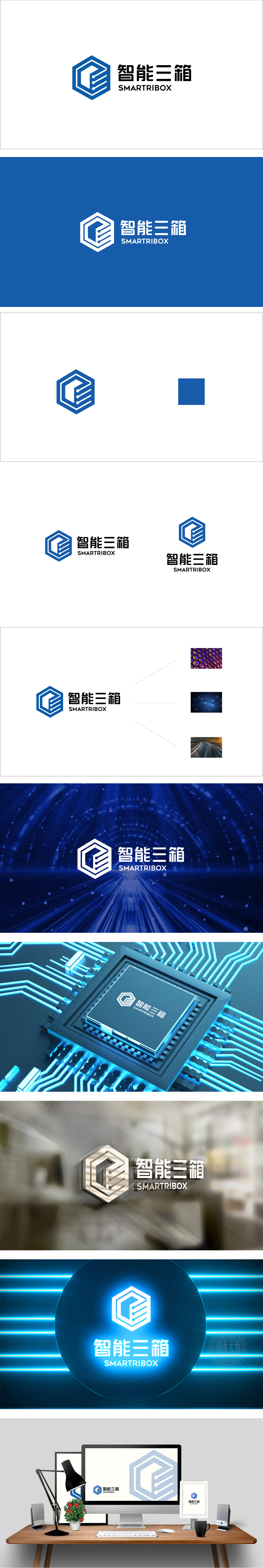
狮动设计采用正六边形作为基础轮廓,六边形在视觉上具有稳定感和均衡性,直接传递出品牌在智能硬件领域的专业性。线条末端的圆点设计类似“数据节点”或“信号连接”,暗示产品的智能化、互联化特性,将“智能”从抽象概念转化为具象视觉符号。选择深蓝色作为主色调,传递“专业”“可靠”“科技”“安全”等情感价值。标志通过“六边形(科技载体)+三箱符号(功能核心)+智能元素(圆点)”的组合,既明确了产品的物理属性(三箱形态),又赋予了其“智能科技”的情感价值,实现从“硬件产品”到“智能解决方案”的品牌定位拔高。
Lion design adopts regular hexagon as the basic outline. Hexagon has a sense of stability and balance in vision, which directly conveys the brand's professionalism in the field of intelligent hardware. The dot design at the end of the line is similar to "data node" or "signal connection", which implies the intelligent and interconnected characteristics of the product and transforms "intelligence" from an abstract concept into a concrete visual symbol. Choose dark blue as the main color to convey emotional values such as professionalism, reliability, technology and safety. Through the combination of "hexagon (technology carrier)+three-box symbol (functional core)+intelligent element.


扫码或拨打添加客服微信


