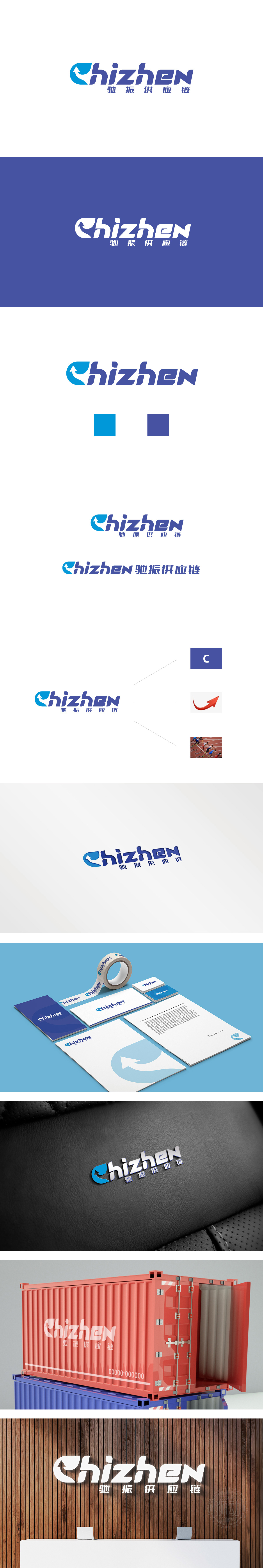
狮动设计以蓝色水滴号形态为基底,嵌入向上箭头,形成“流动中上升”的视觉张力。水滴的液态属性暗示供应链的“流动性”(如物流、资金流、信息流的顺畅运转),向上箭头的动态:箭头锐角朝上,不仅传递“高效、进取、增长”的品牌态度,也直观对应供应链管理中“优化效率、提升价值”的核心目标,亮蓝色:传递“创新、高效、透明”的科技感,贴合现代供应链对数字化、智能化的依赖(如物联网、大数据技术的应用);深蓝色:文字部分的深色提升稳重感,象征“专业、可靠、值得信赖”,理性的色彩、简洁的字体,精准匹配供应链行业“以效率和结果为导向”的务实属性,从视觉到理念的价值传递。
Lion design is based on the blue water drop shape, embedded with the upward arrow, forming the visual tension of "rising in the flow". The liquid nature of water droplets implies the "fluidity" of the supply chain (such as the smooth operation of logistics, capital flow and information flow), and the dynamic of the upward arrow: the acute angle of the arrow is upward, which not only conveys the brand attitude of "high efficiency, enterprising and growth", but also intuitively corresponds to the core goal of "optimizing efficiency and enhancing value" in supply chain management, and the bright blue color conveys the sense of "innovation.


扫码或拨打添加客服微信


