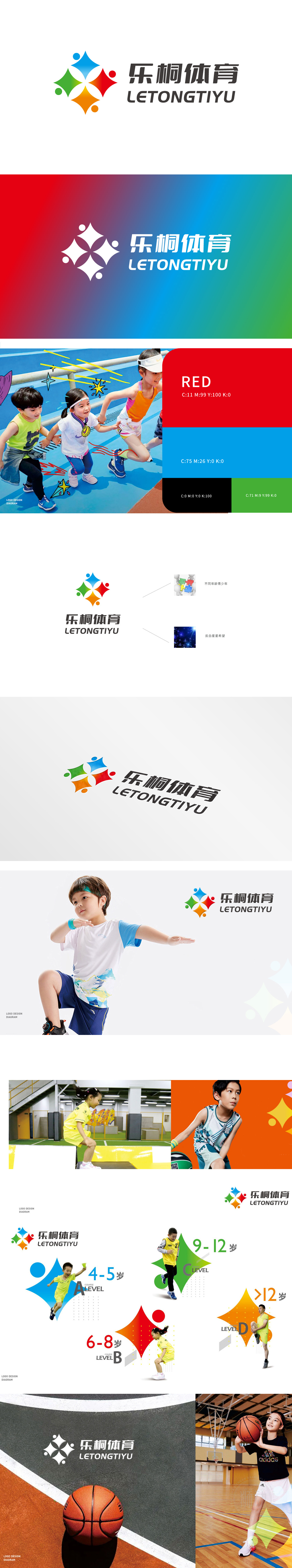
乐桐体育聚焦全民体育服务赛道,委托狮动打造品牌视觉符号时,狮动精准捕捉“活力联结社群”核心诉求。 logo 左侧四色星形融合抽象人形,蓝绿红橙呼应运动多元场景与群体共鸣,动态形态传递热情;右侧“乐桐体育”字体以现代黑体优化结构,刚劲中显亲和温度。 上线后品牌辨识度行业领跑,合作方评价“既抓准体育行业脉搏,又用视觉讲透品牌性格”,狮动以策略性创意为企业撬开市场认知新切口。
When Letong Sports focuses on the national sports service track and entrusts Lion Sports to create brand visual symbols, Lion Sports accurately captures the core appeal of "connecting the community with vitality". The four-color star on the left side of logo blends abstract human figures, and the blue, green, red and orange echo the multi-scene of movement and resonate with the group, and the dynamic form conveys enthusiasm; On the right, the font "Letong Sports" uses modern bold to optimize its structure, showing the affinity temperature in rigidity. After the launch, the brand recognition led the industry, and the partners commented that "it not only grasps the pulse of the sports industry, but also tells the brand character through vision", and Lion Sports opened a new incision in market recognition for enterprises with strategic creativity.


扫码或拨打添加客服微信


