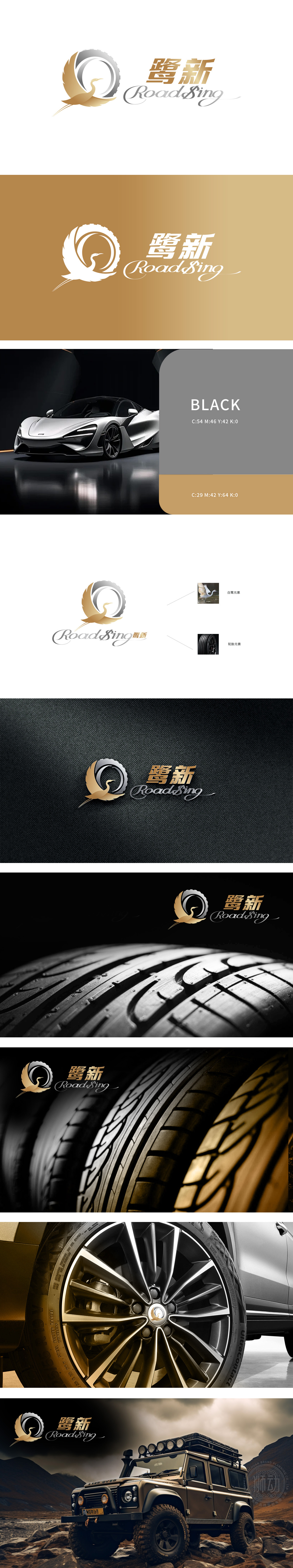
狮动为鹭新打造的logo以轮胎行业特性为基底,提炼“稳健、前行、生态”的核心价值。设计中以鹭鸟象征行业灵动与环保属性,羽翼线条融合轮胎纹路,形成独特视觉符号;金色与银灰配色呼应金属质感与科技感。团队通过深度调研品牌定位,创新地将行业特性与美学表达融合,最终呈现的logo兼具辨识度与品牌张力,助力鹭新在市场中脱颖而出,成为轮胎行业品牌设计的典范。可设计方案,认为其“简洁有力且极具辨识度,完美契合汽配行业特性”。上线后品牌曝光度显著提升,市场反响积极。
The new logo created by the lion moves for the heron is based on the characteristics of the tire industry and refines the core values of "stability, advancement and ecology". In the design, heron symbolizes the agility and environmental protection of the industry, and the wing lines merge with the tire lines to form a unique visual symbol; The color matching of gold and silver gray echoes the metallic texture and sense of technology. Through in-depth research on brand positioning, the team innovatively integrated industry characteristics and aesthetic expression, and finally presented a logo with both recognition and brand tension, which helped Luxin stand out in the market and become a model of brand design in the tire industry.


扫码或拨打添加客服微信


