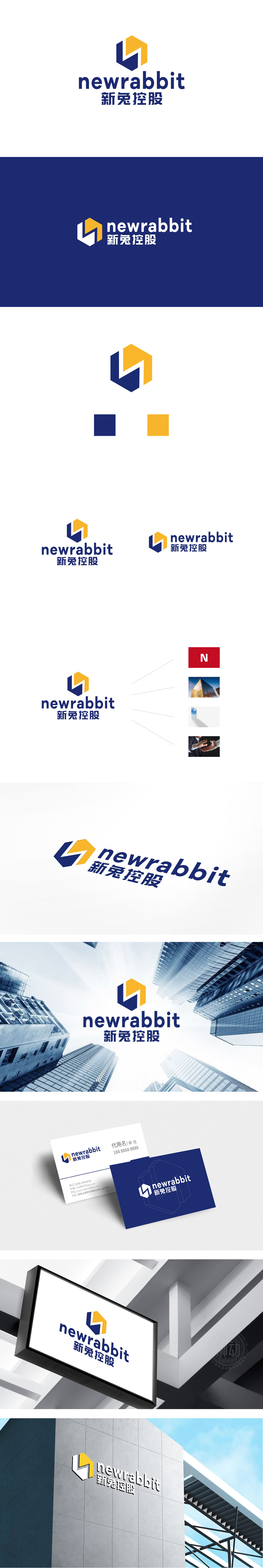
狮动设计采用几何美学与品牌隐喻的融合,六边形主体:稳定与开放的视觉平衡,既传递了控股企业的稳健性,又暗示业务生态的扩展性。“N”与“兔”的双关抽象,兼顾了“新兔”的品牌名识别与企业的成熟定位。蓝色(沉稳、专业)与橙色(创新、活力)的经典搭配,既通过冷暖对比增强视觉冲击力,又隐喻企业“稳健中蕴含活力”的品牌性格。设计与战略的深度绑定,传递出“精准决策”“高效执行”的品牌联想。
Lion design adopts the fusion of geometric aesthetics and brand metaphor, and the visual balance of hexagonal subject: stability and openness not only conveys the stability of holding enterprises, but also implies the expansion of business ecology. The pun abstraction of "N" and "Rabbit" takes into account the brand name recognition of "New Rabbit" and the mature positioning of the enterprise. The classic combination of blue (steadiness and professionalism) and orange (innovation and vitality) not only enhances the visual impact through the contrast between .


扫码或拨打添加客服微信


