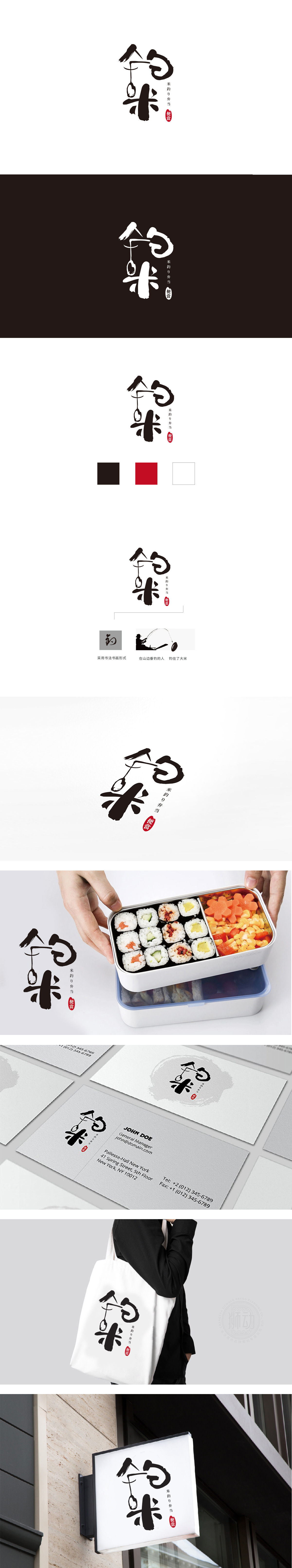
狮动设计将书法笔触与意象融合,传递日式“侘寂”美学,采用毛笔书法风格,笔画粗细变化自然,墨色浓淡呼应,既保留了汉字的结构美感,又融入日式书法的“留白”与“随性”。“钓”字下方巧妙嵌入鱼形弯钩,与“钓り”(钓鱼)的语义直接关联,视觉上形成“用鱼竿钓起米饭/食材”的趣味联想,暗合日式料理“从自然取材”的理念。“米”字扎实厚重,如同饱满的米饭,整体构成“以钓喻食”的隐喻——日式料理讲究“一期一会”的精致,也强调食材的新鲜本味,如同钓鱼般耐心等待、珍视每一份食材。这种“形义结合”的设计,用极简线条传递了“日式便当的匠心与自然属性”。这种“小而美”的设计,恰如其分地呼应了日式餐饮“精致、自然、仪式感”的核心价值。
Lion design combines calligraphy strokes with images, conveying the Japanese "silence" aesthetics, and adopts the brush calligraphy style. The stroke thickness changes naturally and the ink color echoes, which not only retains the structural beauty of Chinese characters, but also integrates the "blank space" and "casualness" of Japanese calligraphy. The fish-shaped hook is cleverly embedded under the word "fishing", which is directly related to the semantics of "fishing" (fishing), and visually forms an interesting association of "fishing rice/ingredients with a fishing rod", which coincides with the concept of "taking materials from nature" in Japanese cuisine.


扫码或拨打添加客服微信


