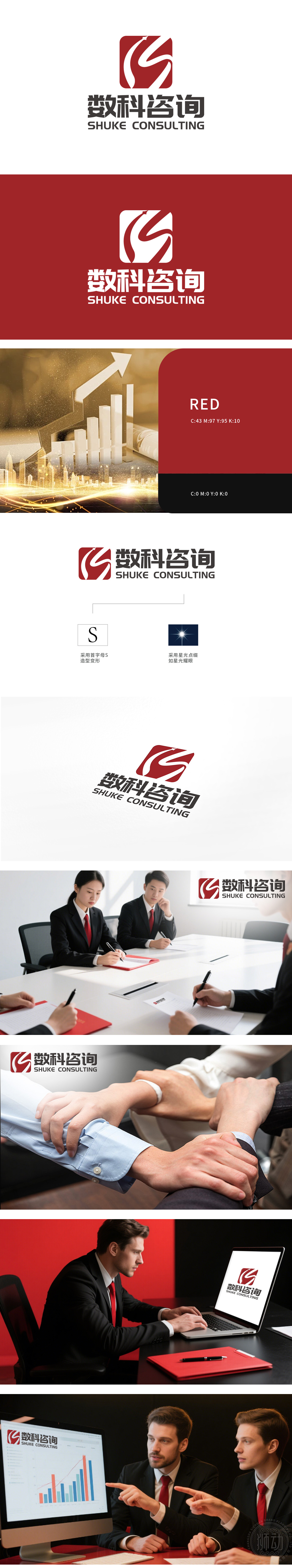
狮动为数科咨询设计的LOGO,以旋转的“S”为核心视觉符号,创新融合几何美学与行业特性。红色动态线条彰显咨询服务的专业活力,白色负空间构建理性与信任感。中英文品牌名称的简洁布局,该设计不仅强化了数科咨询的“智慧+科技”形象,更通过视觉语言提升了政府客户的认知度与信任感,成为咨询行业品牌创新的标杆案例。
Lion Motion is a LOGO designed by digital consulting, with the rotating "S" as the core visual symbol, which innovatively integrates geometric aesthetics and industry characteristics. Red dynamic Lines highlight the professional vitality of consulting services, and white negative space builds rationality and trust. The concise layout of Chinese and English brand names not only It has strengthened the image of "wisdom+technology" in mathematics consulting, and enhanced the recognition and trust of government customers through visual language, becoming a consulting firm.Benchmarking case of industry brand innovation.


扫码或拨打添加客服微信


