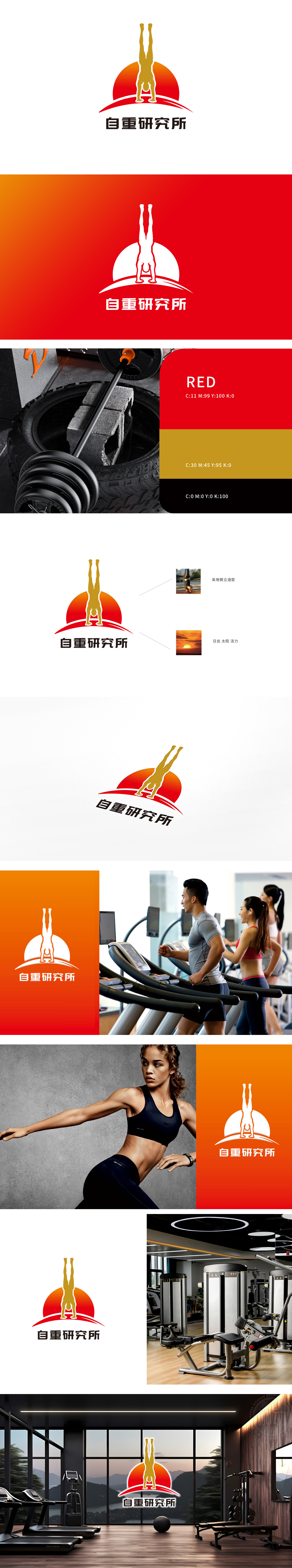
狮动为自重公司设计的logo以动态倒立人物为核心,精准诠释品牌理念。金色人物象征力量与自律,红色渐变背景如朝阳迸发活力,线条流畅兼具现代感。设计团队深入调研健身行业视觉趋势,将“自我挑战”抽象为平衡美学,打造独特记忆点。logo应用场景广泛,从器械到宣传物料皆醒目,助力自重品牌在市场中快速建立专业形象,彰显狮动对品牌基因与视觉传达的深度融合能力。
The logo designed by Lion Motion for the self-respecting company takes dynamic inverted figures as the core and accurately interprets the brand concept. The golden characters symbolize strength and self-discipline, and the red gradient background is like the vitality of Chaoyang generate, with smooth lines and modern feeling. The design team thoroughly investigated the visual trend of the fitness industry, abstracted "self-challenge" into balanced aesthetics, and created unique memory points. Logo has a wide range of application scenarios, from equipment to promotional materials, which helps self-respecting brands to quickly establish a professional image in the market and demonstrates the deep integration of brand genes and visual communication by Lion Motion.


扫码或拨打添加客服微信


