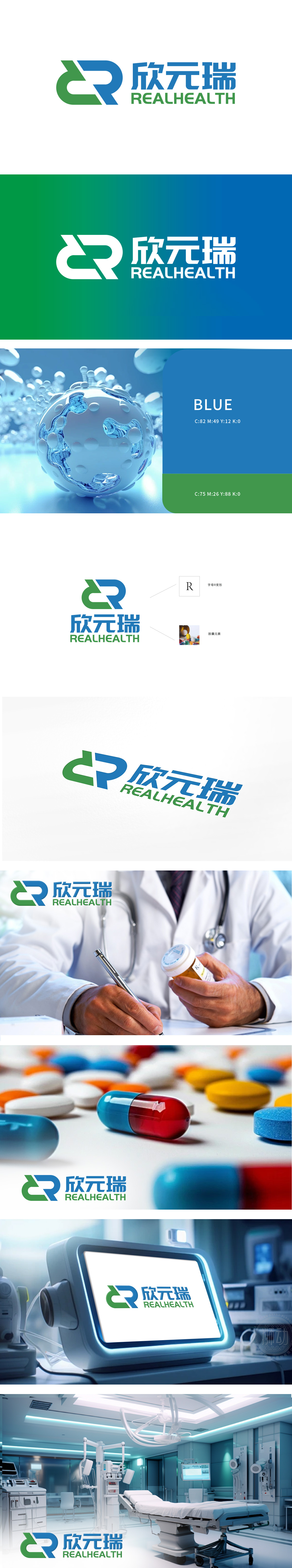
欣元瑞委托狮动设计的REALHEALTH品牌logo,精准捕捉医药行业核心价值。双R交织结构象征科学分子结构与合作理念,绿色传递生命活力,蓝色彰显科技信赖。中英文品牌名虚实结合,兼顾本土与国际市场。狮动深度解析行业特性,以视觉符号构建专业形象,使欣元瑞在竞争中脱颖而出。该设计既传递医疗严谨性,又蕴含创新生命力,成为医药品牌视觉沟通的标杆之作。
Xin Yuanrui commissioned the REALHEALTH brand logo designed by Lion Motion to accurately capture the core value of the pharmaceutical industry. The double-R interwoven structure symbolizes the scientific molecular structure and cooperation concept, green conveys vitality, and blue highlights scientific and technological trust. Chinese and English brand names should be combined with reality, taking into account local and international markets. Lion deeply analyzes the characteristics of the industry, constructs a professional image with visual symbols, and makes Xin Yuanrui stand out from the competition. This design not only conveys medical rigor, but also contains innovative vitality, which has become a benchmark for visual communication of pharmaceutical brands.


扫码或拨打添加客服微信


