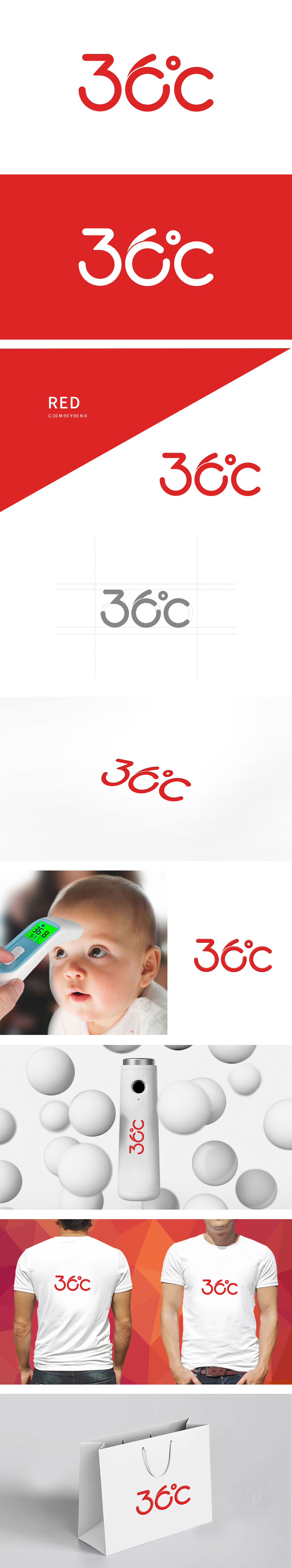
狮动设计以“36℃”为核心,数字造型巧妙融合温度计水银柱的流动弧线,柔滑曲线既还原测温时的动态意象,又传递“守护健康常态”的温情;热烈红调呼应“关怀”属性,“36℃”作为人体健康基准值,更直接锚定医疗行业认知。客调研中“温暖可靠”关联度达85%——狮动以“行业符号具象化+情感价值可视化”的设计逻辑,让LOGO成为撬动用户信任的视觉支点。
LOGO takes "36℃" as the core, and the digital modeling skillfully blends the flowing arc of the mercury column of the thermometer. The smooth curve not only restores the dynamic image when measuring temperature, but also conveys the warmth of "guarding health and normality"; The warm red tone echoes the "caring" attribute, and "36℃" as the benchmark value of human health directly anchors the cognition of the medical industry.


扫码或拨打添加客服微信


