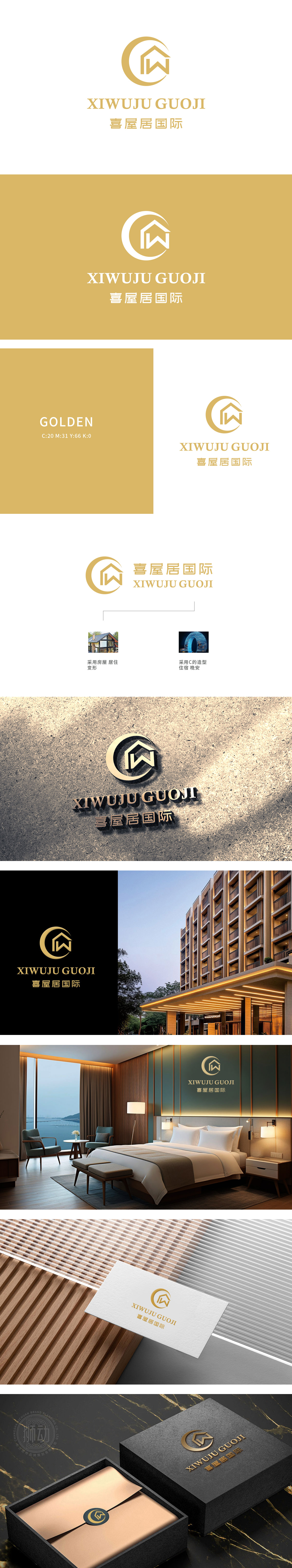
狮动设计融合「月牙(全球化视野/生活圆满)+房屋轮廓(家居属性)+首字母W(品牌专属记忆)」,用极简线条串联“行业属性-品牌基因-情感价值”;甄选鎏金配色,既契合高端住宿的品质调性,又通过暖色调弱化商业距离感,强化“家”的温馨认知;客户反馈“看LOGO就懂业务、读符号就记品牌”。狮动以「美学×商业×用户感知」的三维设计逻辑,让标识成为品牌拓局市场的“第一眼竞争力”。
Lion design combines "crescent moon (global vision/complete life)+house outline (home attribute)+initials w (brand exclusive memory)", and connects "industry attribute-brand gene-emotional value" in series with minimalist lines; The selection of gold-plated color scheme not only conforms to the quality tonality of high-end accommodation, but also weakens the sense of commercial distance through warm colors and strengthens the warm cognition of "home".


扫码或拨打添加客服微信


