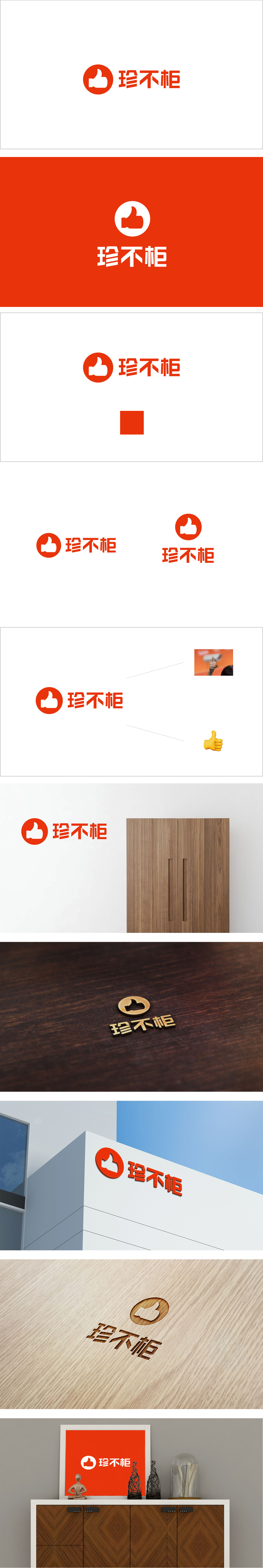
狮动设计采用红色圆形包裹白色点赞手势,传递“认可、推荐”。圆形轮廓传递亲和力,符合电商平台“友好、易接近”的品牌调性。中文字体“珍不柜”的结构化处理:字体采用方正、略带几何感的设计,笔画粗壮有力,传递稳定、可靠的品牌形象,符合电商平台对“专业性”的潜在诉求。字形左右结构对称,视觉重心平衡,增强LOGO的稳重感。设计与电商属性的深度绑定,“以用户认知为起点,以商业目标为终点”的设计思路,正是优秀电商品牌视觉系统的核心特质。
Lion design uses a red circle wrapped in a white praise gesture to convey "approval and recommendation". The circular outline conveys affinity, which is in line with the brand tonality of "friendly and accessible" of e-commerce platform. Structured treatment of Chinese font "rare but not cabinet": the font is square and slightly geometric, with strong strokes, conveying a stable and reliable brand image, which meets the potential appeal of e-commerce platform for "professionalism". The left and right structure of the glyph is symmetrical, the visual center of gravity is balanced, and the sense of stability of the LOGO is enhanced.


扫码或拨打添加客服微信


