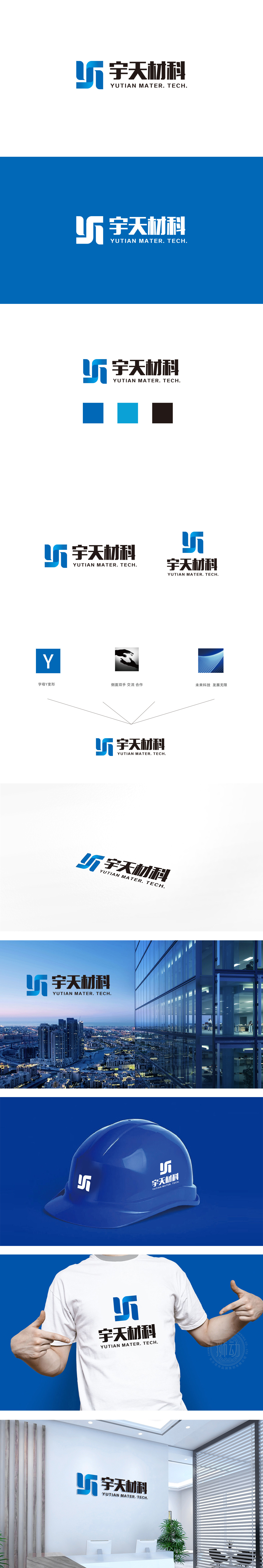
狮动设计采用蓝色为主色调,由多个不规则多边形(类似箭头、盾牌、齿轮的抽象化组合)构成:向上的箭头趋势:传递企业积极进取、技术突破的品牌态度,符合材料科技行业对创新的追求。交错的“保护罩”意象:暗喻材料的坚固耐用性,同时“包裹”形态也可能象征对技术细节的精密把控,符合材料科技领域对稳定性和可靠性的行业要求。整体通过抽象几何图形的科技隐喻、蓝色系的专业色彩、硬朗的文字风格,精准传递了材料科技行业所需的“可靠、创新、专业”品牌形象。
Lion Design adopts blue as the main color, and is composed of several irregular polygons (similar to the abstract combination of arrows, shields and gears): upward arrow trend: conveying the brand attitude of enterprise's initiative and technological breakthrough, which is in line with the pursuit of innovation in materials science and technology industry.Interlaced "protective cover" image: it is a metaphor for the firmness and durability of materials, and at the same time, the "wrapped" form may also symbolize the precise control of technical details, which meets the industry requirements of stability and reliability in the field of materials science and technology.


扫码或拨打添加客服微信


