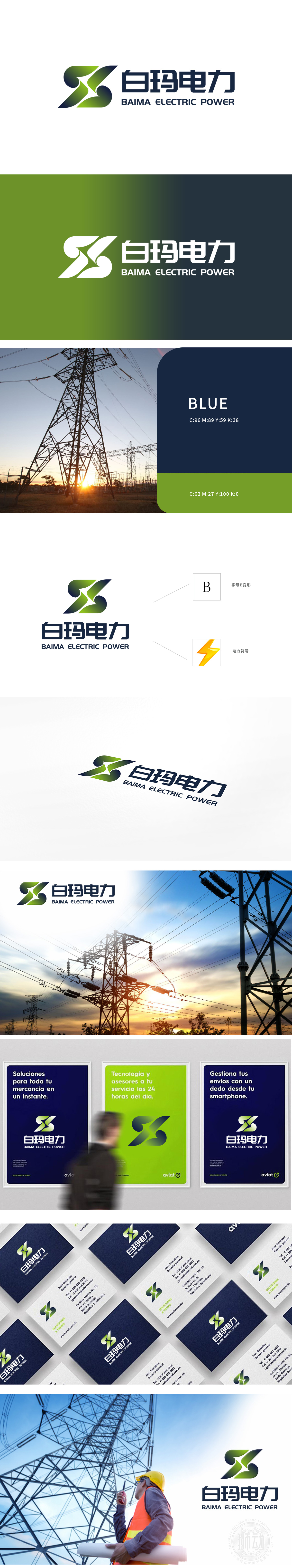
狮动受白玛电力委托设计品牌logo。团队精准捕捉其科技与环保理念,以绿色、深蓝渐变交织的双“S”造型,象征能源循环与创新动力;字体采用现代简洁风格,强化专业形象。方案极具辨识度,完美传递企业核心价值。新客户观摩后高度赞赏狮动的创意深度与执行力,直言“这才是真正的品牌赋能”!
Lion Motion was commissioned by Baima Power to design the brand logo. The team accurately captures its concept of science and technology and environmental protection, and symbolizes energy cycle and innovation power with the double "S" shape of green and dark blue gradual interweaving; The font adopts modern concise style to strengthen professional image. The scheme is highly recognizable and perfectly conveys the core value of the enterprise. After observing, new customers highly appreciated the creative depth and execution of Lion Motion, and bluntly said, "This is the real brand empowerment"!


扫码或拨打添加客服微信


