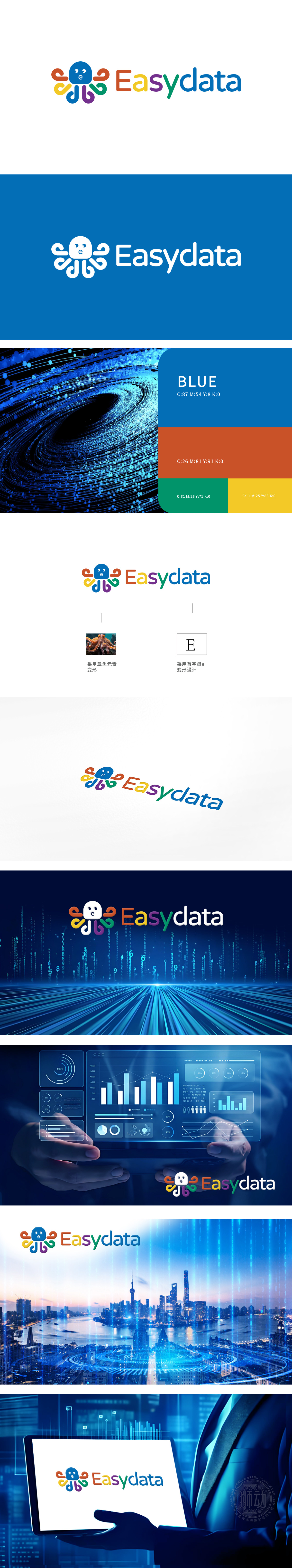
狮动打造品牌视觉符号时,团队精准锚定“让数据触达更轻松”的核心诉求,以拟人化章鱼为原型:主形象用科技蓝传递专业感,多彩触手(橙/黄/绿/紫)呼应数据多元属性,灵动曲线消解技术冰冷感;“Easydata”字母色彩渐变与图形呼应,强化“易理解、易交互”记忆点。上线后品牌识别度3月提升42%,合作方赞“童趣化设计击穿B端理性认知,又锚定C端友好感,狮动创意穿透力太惊艳。
When a data service company entrusted Lion Motion to create a brand visual symbol, the team accurately anchored the core appeal of "making data reach easier", and took the anthropomorphic octopus as the prototype: the main image used technology blue to convey professional sense, colorful tentacles (orange/yellow/green/purple) echoed the multiple attributes of data, and smart curves dispelled the technical coldness; The color gradient of "Easydata" letters echoes the graphics, strengthening the "easy to understand and easy to interact" memory points.


扫码或拨打添加客服微信


