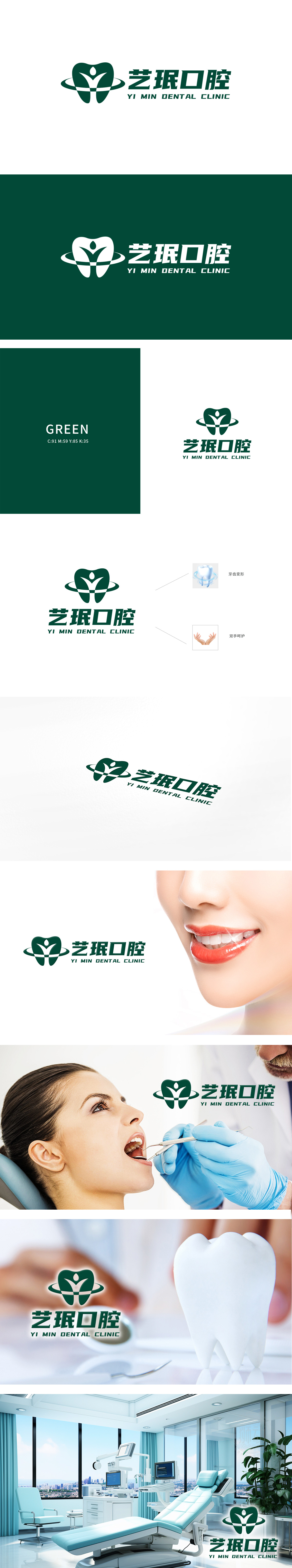
艺珉口腔委托狮动设计品牌logo。狮动团队精准捕捉医疗行业特质,以绿色为主色调传递健康理念,将牙齿轮廓与人形图案巧妙融合,象征专业与人文关怀。两侧弧线设计赋予动态美感,中英文标识简洁醒目。客户对狮动的创意表达与专业执行力高度认可,称赞其作品“既符合行业属性又极具辨识度,完美展现品牌价值”。
Yimin Dental entrusted Lion to design the brand logo. The Lion Movement Team accurately captures the characteristics of the medical industry, conveys the health concept with green as the main color, and skillfully blends the tooth outline with the humanoid pattern, symbolizing professionalism and humanistic care. The arc design on both sides gives a dynamic aesthetic feeling, and the Chinese and English logos are concise and eye-catching.


扫码或拨打添加客服微信


