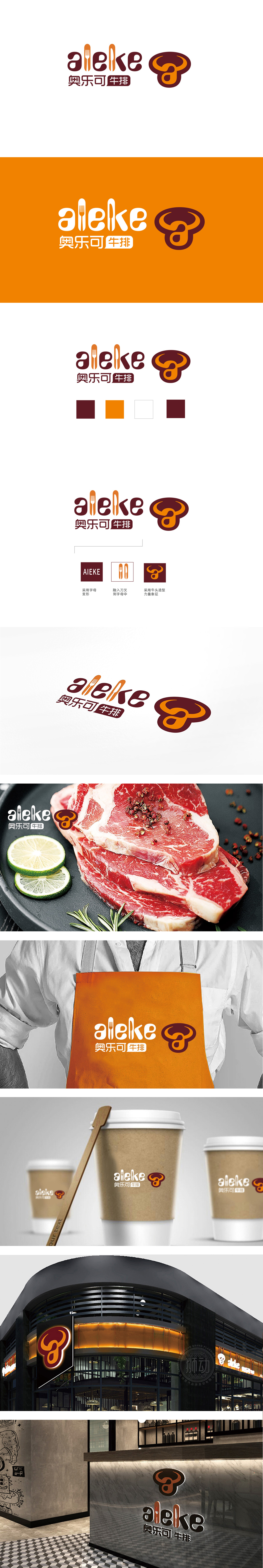
狮动设计把“牛排”的所有感官记忆,压缩成了一个能“撞进眼睛”的符号,牛头像,牛角是圆润的,像煎牛排的锅沿;牛嘴的弧度,像咬开的牛排截面,连颜色都选了“煎牛排的焦褐感+流汁的橙红色”,把“新鲜牛扒”的原料感,直接刻进了图形里;餐具替换,更绝——叉子和刀子是吃牛排的“仪式感工具”,不用解释“我们卖西餐”,只要看到这两个符号,大脑立刻会弹出“坐下来、切牛排、咬一口”的场景。用「符号化的原料」+「场景化的工具」+「有温度的风格」,让「牛排」这个概念自然融入品牌视觉,传递温暖感与专业感的平衡。
Lion design compresses all the sensory memories of "steak" into a symbol that can "bump into the eyes". The head of a cow and the horn are round, like the edge of a frying steak; The radian of the mouth of a cow is like the cross section of a bitten steak, and even the color is "brown feeling of fried steak+orange red of juicy juice", which directly engraves the raw material feeling of "fresh steak" into the figure; Tableware replacement is even more unique-forks and knives are "ceremonial tools" for eating steak. Without explaining "we sell western food", as long as you see these two symbols, your brain will immediately pop up the scene of "sitting down, cutting steak and taking a bite".


扫码或拨打添加客服微信


