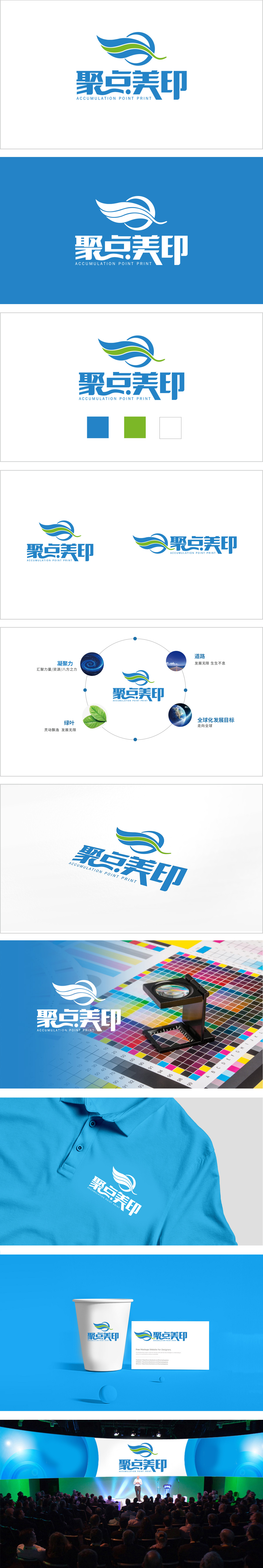
狮动设计采用流动的“印”与“聚”的视觉化,蓝色与绿色的波浪/飘带造型,形似展开的纸张、扬起的旗帜,巧妙呼应“美印”的印刷、印务行业属性。线条的流动感既传递出设计的灵动性,也暗示“聚合创意、输出美好”的品牌理念。蓝色半圆环与飘带形成闭环趋势,强化“聚点”的“汇聚、聚焦”概念,符号化地表达“凝聚资源、专注品质”的核心价值,整体无棱角的曲线设计传递柔和、专业的品牌气质。“美印”的表达:色彩的清新感、线条的流畅美,以及“印”的行业隐喻,将“美好印刷”的抽象概念转化为可感知的视觉语言,通过流动线条与清新色彩展现“美印”的差异化——即“不止于印刷,更注重设计与创意的聚合输出”。
Lion design adopts the visualization of flowing "seal" and "gathering", and the blue and green wave/ribbon shapes are similar to unfolded paper and raised flags, cleverly echoing the printing and printing industry attributes of "Meiyin". The fluidity of lines not only conveys the agility of design, but also implies the brand concept of "aggregating creativity and exporting beauty". The blue semicircle and the ribbon form a closed-loop trend, which strengthens the concept of "gathering and focusing" and symbolically expresses the core value of "gathering resources and focusing on quality".The overall curve design without edges and corners conveys a soft and professional brand temperament.


扫码或拨打添加客服微信


