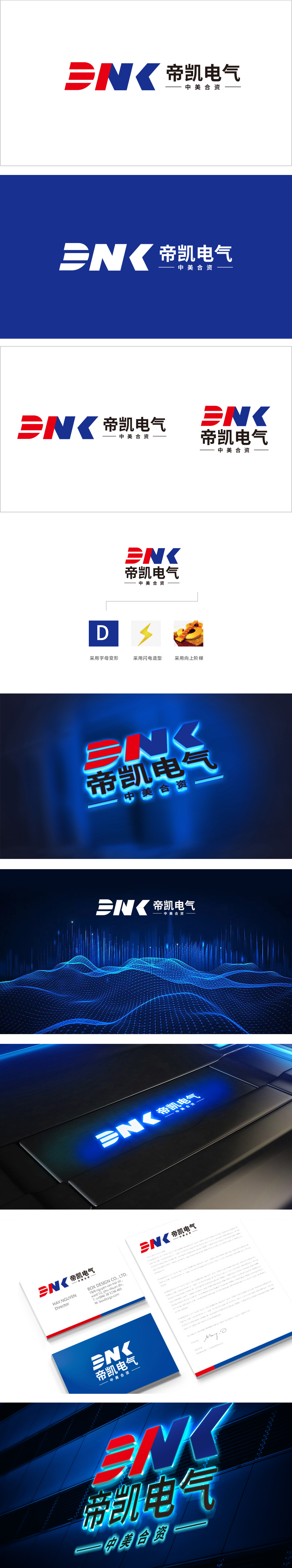
狮动设计以平行的红色色块构成“D”的变体,采用开放式线条与色块拼接,形成类似“电流流动”的视觉联想,“N”与“K”的结构呼应:赋予静态图形以动态张力,暗合电气行业的“技术突破”与“能量延伸”意象。色彩对比与行业属性:红色(热情、动力)与蓝色(科技、专业)的经典撞色组合,符合电气行业对“能源”与“技术”的双重属性定位,整体以“字母抽象+色块拼接”为核心,直线条、几何色块、高饱和色彩的组合,精准传达了电气行业所需的“专业、可靠、高效”的品牌性格。
Lion Design uses parallel red color blocks to form a variant of "D", and uses open lines and color blocks to form a visual association similar to "current flow". The structure of "N" and "K" echoes: giving static graphics dynamic tension, which coincides with the images of "technical breakthrough" and "energy extension" in the electrical industry. Color contrast and industry attribute: the classic contrast color combination of red (enthusiasm and power) and blue (technology and specialty) conforms to the dual attribute positioning of "energy" and "technology" in the electrical industry. The overall focus is "letter abstraction+color block splicing", and the combination of straight lines.


扫码或拨打添加客服微信


